Pinhole PhotographyPhotographs taken with a handmade pinhole camera, self-developed in the darkroom. Italy.
Welding SculptureSmall-scale sculpture made with welding techniques.
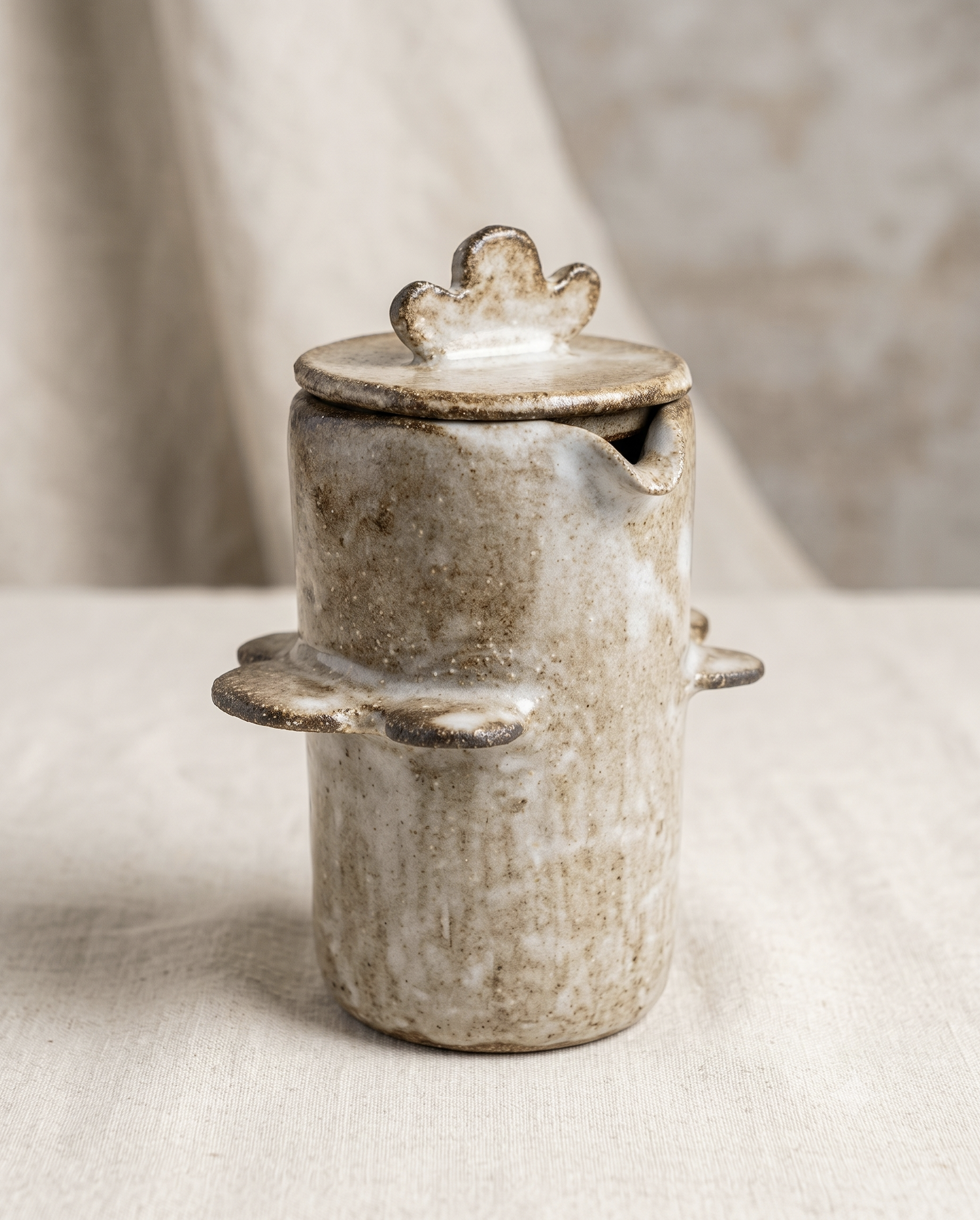
Mini VaseIrregular small-form vase, hand technique. Barcelona.
Protected Project
This case study is shared selectively. Please enter the password provided by Monika.
Incorrect password. Please try again.
Under Construction
This case study is being written. Check back soon.
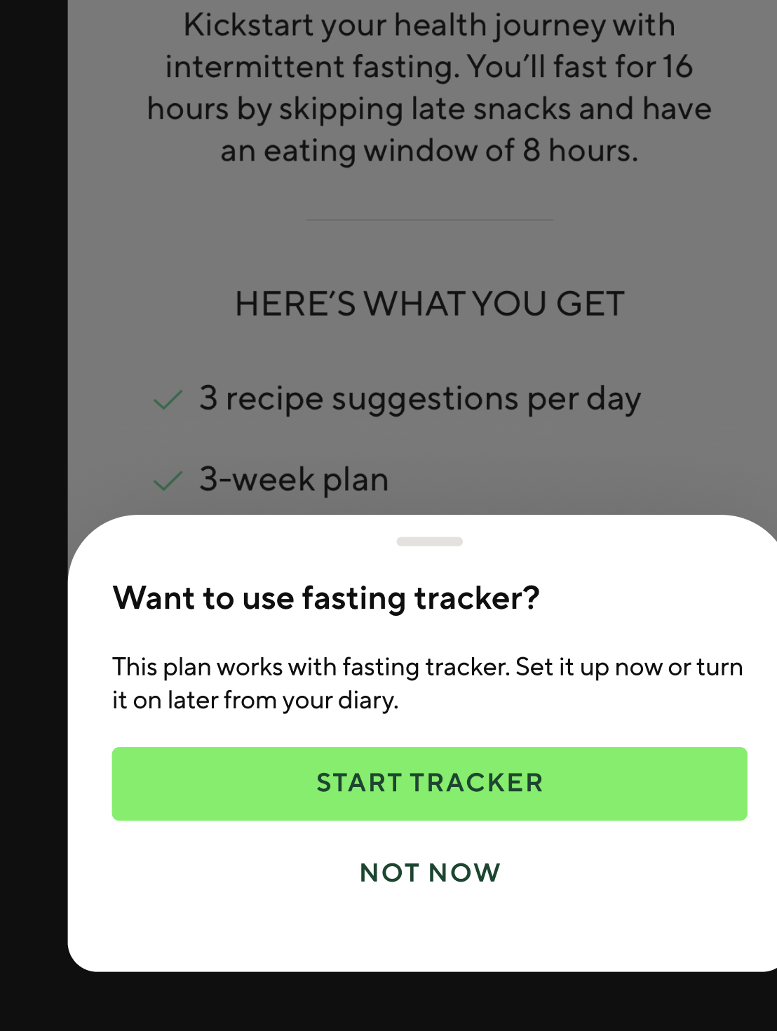
Fasting Tracker
LifesumProduct Designer
iOS & Android7 Weeks2025–2026
The story
Lifesum removed the fasting tracker. Within weeks, customer support was overwhelmed with users asking where it had gone. I built the investigation. I built the case. Leadership agreed to bring it back — and what started as a resurrection quickly became something closer to a ground-up rebuild.
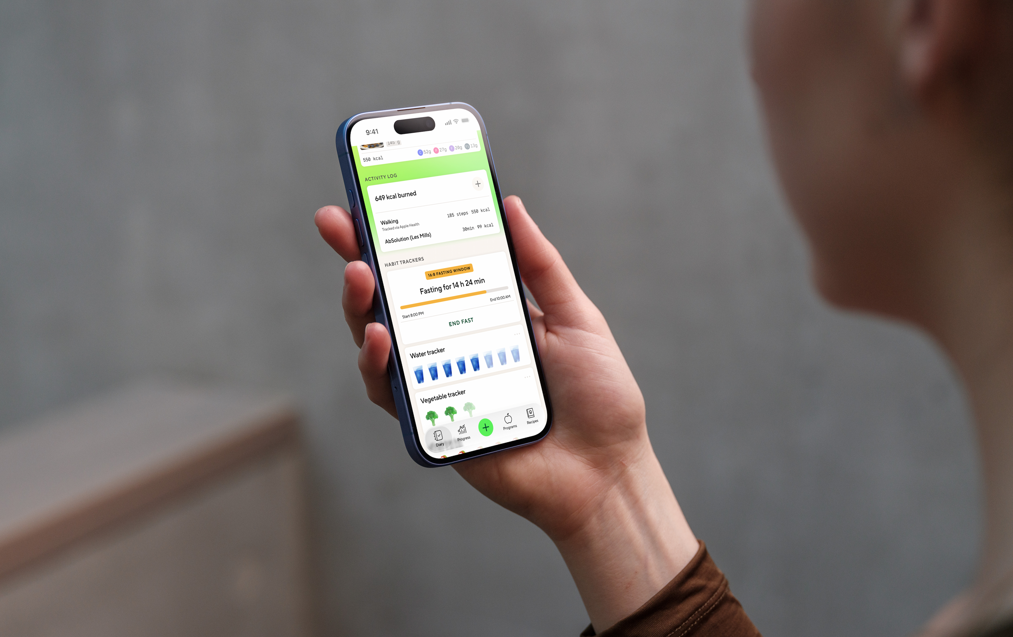
A compact fasting card lives in the diary — always visible, never in the way. Status at a glance, one tap to go deeper.
The investigation
Five angles simultaneously — competitor analysis across the top-rated fasting apps, app store sentiment, internal data, and qualitative research I conducted myself. The research showed a clear majority of users felt frustrated by the removal. Most expected the tracker to live directly in the diary. The old version didn't. Across five competitor apps, not one handled the messiness of real fasting behaviour — starting late, forgetting to stop, wanting to correct yesterday's session.
The investigation deck I built to make the case for bringing it back.
The real problem
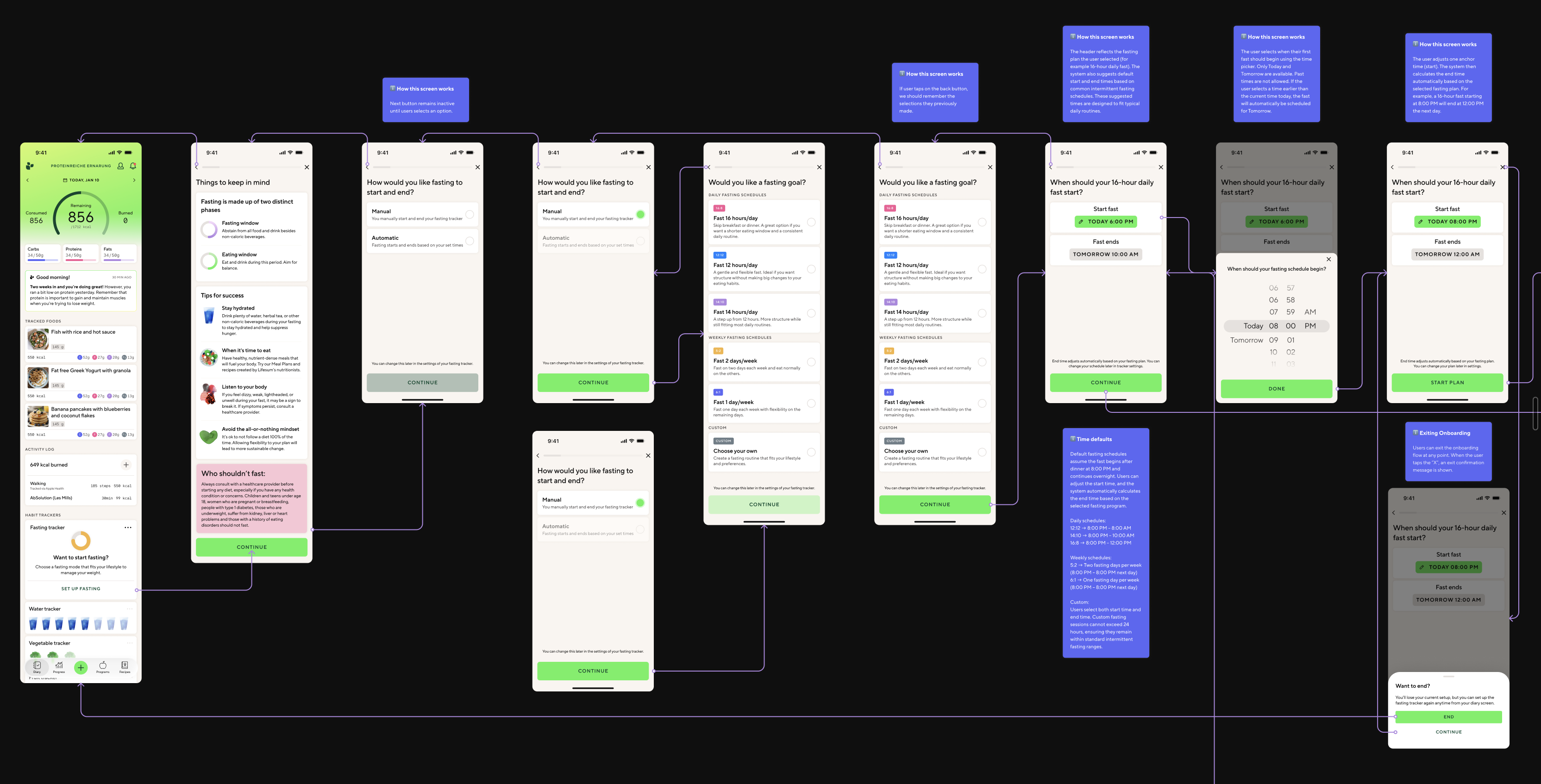
The brief was "bring it back." The assumption in the room was that meant roughly what the old version had been — a basic timer with start and stop. I pushed back with a map. Fasting touches the calorie wheel, macro targets, AI coaching tips, meal nudges, streak mechanics, and the diary. Build it naively and it corrupts all of them. Activate a fast and the AI tells a user to eat. Record an incomplete session and streak calculations break. Every one of those interactions needed an explicit rule. None existed. I asked for more time. I got it. What I didn't get was the nutritionist — she went on maternity leave midway through. No research team. No reusable code. Barely any legacy design files. It was closer to a greenfield project than a resurrection.
How I approached it
The competitive research revealed that most fasting apps are built around a single mental model: the timer. Start it, stop it, done. That simplicity is also their ceiling. I decided early that wasn't the right frame — and that the complexity here wasn't aesthetic, it was conceptual. The first thing I built wasn't a screen. It was a model.
01
The Plans and Modes
Fasting plans (16:8, 18:6, etc.) with the freedom to choose between automatic and manual mode — and safe fasting tips woven throughout.
02
The Core States and Flows
Every flow from onboarding to editing a fast, history, and stats. Every state accounted for — including rare edge cases and empty states.
03
The Fast Data
What data to capture and send to backend — start time, end time, duration, edit status — to power nutritional intelligence, history, and stats.
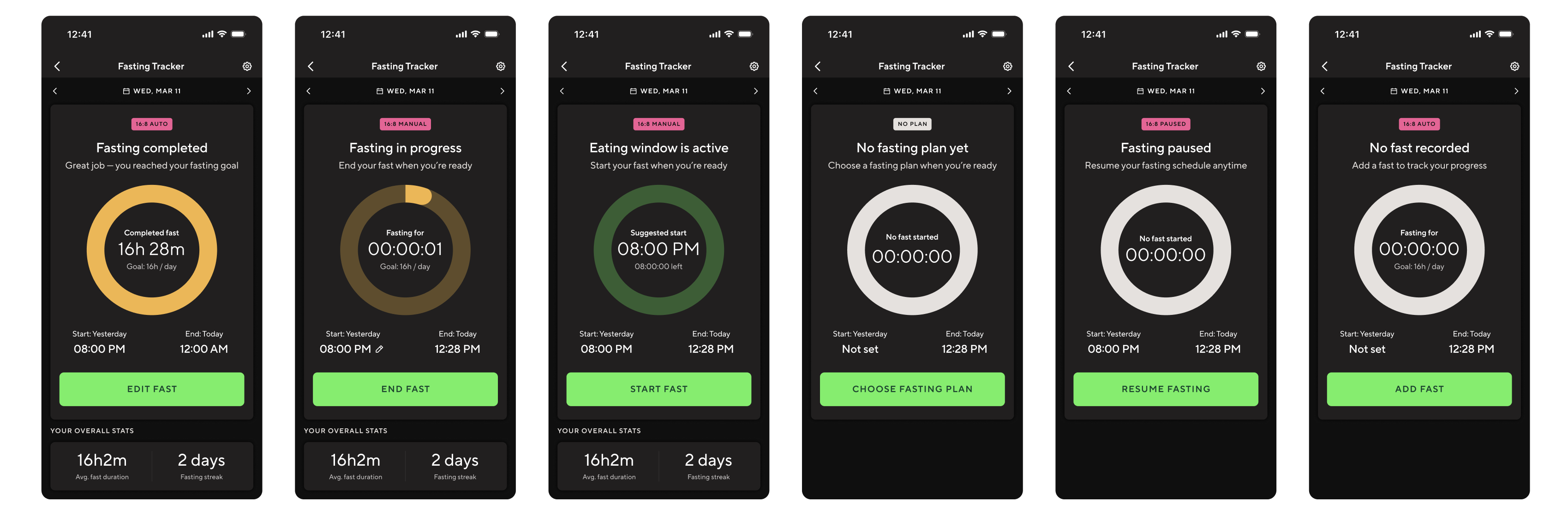
Eight tracker states in dark mode — different system behaviours requiring different UI, copy, and CTA logic.
What I built
Two surfaces. A compact fasting card in the diary for quick status and a single CTA. A full tracker view for duration, timestamps, history, and controls.
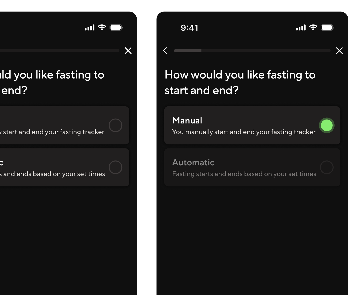
Automatic and manual modes. Manual treats the schedule as a suggestion — the user controls start and stop. Automatic runs transitions without user action. No direct competitor offered both with this level of clarity.
An editing and recovery model. Users can correct any recorded fast — edit start or end time, update a completed session, delete, or re-add. Active fasts allow quick inline correction. Completed fasts open a dedicated edit flow.
Explicit meal plan interaction logic. Selecting a fasting meal plan never silently updates the tracker. The system prompts, asks, or stays quiet — depending on what's already active. User control is always preserved.
Fasting-aware, nutrition-neutral rules. Fasting changes the timing of eating, not the nutritional targets. Daily calorie budgets and macro goals stay fixed. This boundary was the most important rule I defined.
Manual mode vs automatic mode. Same plan logic, different levels of user control.
Meal plan interaction. Every state transition is intentional.
The AI workflow
No translations team. No research team. No localisation manager. I used Claude as a systems-thinking partner throughout the project — pressure-testing state logic, surfacing contradictions I'd have missed alone. At handoff, I built an extraction pipeline using Claude Code and a Figma MCP that scanned 1,576 text nodes across 300+ components in seconds. It matched every string against 137 existing Lokalise keys, identified 27 exact reuses (saving translation cost across 16 languages), flagged 5 near-matches worth editing to reuse, and generated 95 new keys following the exact naming convention in the codebase. The output was a developer-ready CSV and a 16-language Google Sheet with pre-filled translations for every reused string — clean enough that it imported without clarification.
1,576
Text nodes scanned
Across 300+ components, in seconds.
27
Existing keys reused
16 languages pre-translated at zero additional cost.
95
New localisation keys generated
Following the exact naming convention in the codebase. Imported clean, first pass.
The onboarding flow. Every branch is a product decision.
Tradeoffs
I traded visual refinement for logical completeness. The screens are clean and consistent, but I didn't push the visual design as far as I would have liked. Given the choice between nailing the state logic and nailing the aesthetics, I chose logic every time — because a visually polished tracker with broken edge cases would generate problems. A less polished tracker with correct behaviour would not. I traded user validation for speed. There were no usability tests before handoff. No prototype testing, no moderated sessions, no A/B variants. Every decision was based on competitive benchmarking, qualitative research, and edge-case pressure testing with Claude. Some of those decisions will turn out to be wrong. We won't know which ones until the feature is live. I designed the nutrition interaction rules without a clinical expert. The nutritionist was on maternity leave for most of the project. The rules held up when she reviewed them on return — but that's not the same as having her shape the questions from the start. The alternative was waiting, and the work couldn't wait.
What I'd do differently
Pull the nutritionist in at week one, not week seven. The highest-stakes decisions were the ones made with the least expert input. Next time, nutrition expertise shapes the questions from the start — not signs off at the end.
[ 02 ] · Lifesum · 2025–2026
GLP-1 Companion Experience
Product Designer · Stockholm
Helping people navigate the complex health and wellbeing journey of GLP-1 treatment — through guidance that feels empowering, not clinical.
Context
GLP-1 medications are increasingly prescribed for weight management and metabolic health. But the side effects — nausea, fatigue, dietary changes — can be disorienting without clear guidance. This project explores how Lifesum can become a genuine companion for people going through treatment.
My Role
Early-stage exploration and user research
Interaction design for companion experience flows
Cross-functional collaboration with health and product teams
Status
Early exploration phase. Visuals shared under NDA — please request access directly.
Maia
GSA × Clinical Innovation ZoneDesign Futurist
16 Weeks2018–2019Speculative Design
The story
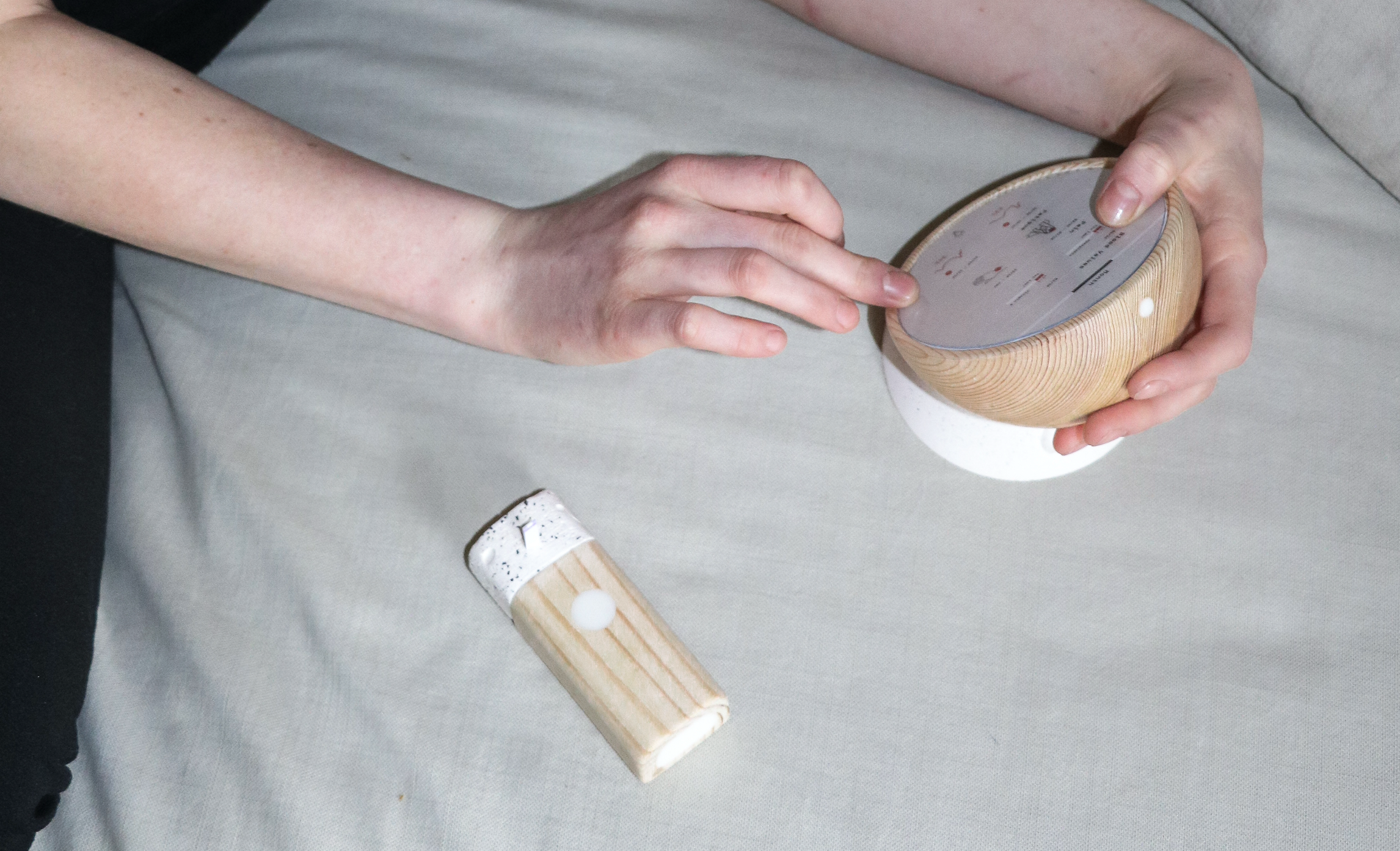
The brief said design for 2028. It also said: become fluent in precision medicine, genomic medicine, clinical trials, and cancer treatment. I was a design student, not a medical professional. That gap was the whole challenge. Primary research — interviews with oncologists, pathologists, and cancer survivors — revealed a specific, poorly-served problem: post-treatment survivorship. Treatment ends. Appointments stop. Patients go home. Fear of recurrence doesn't.
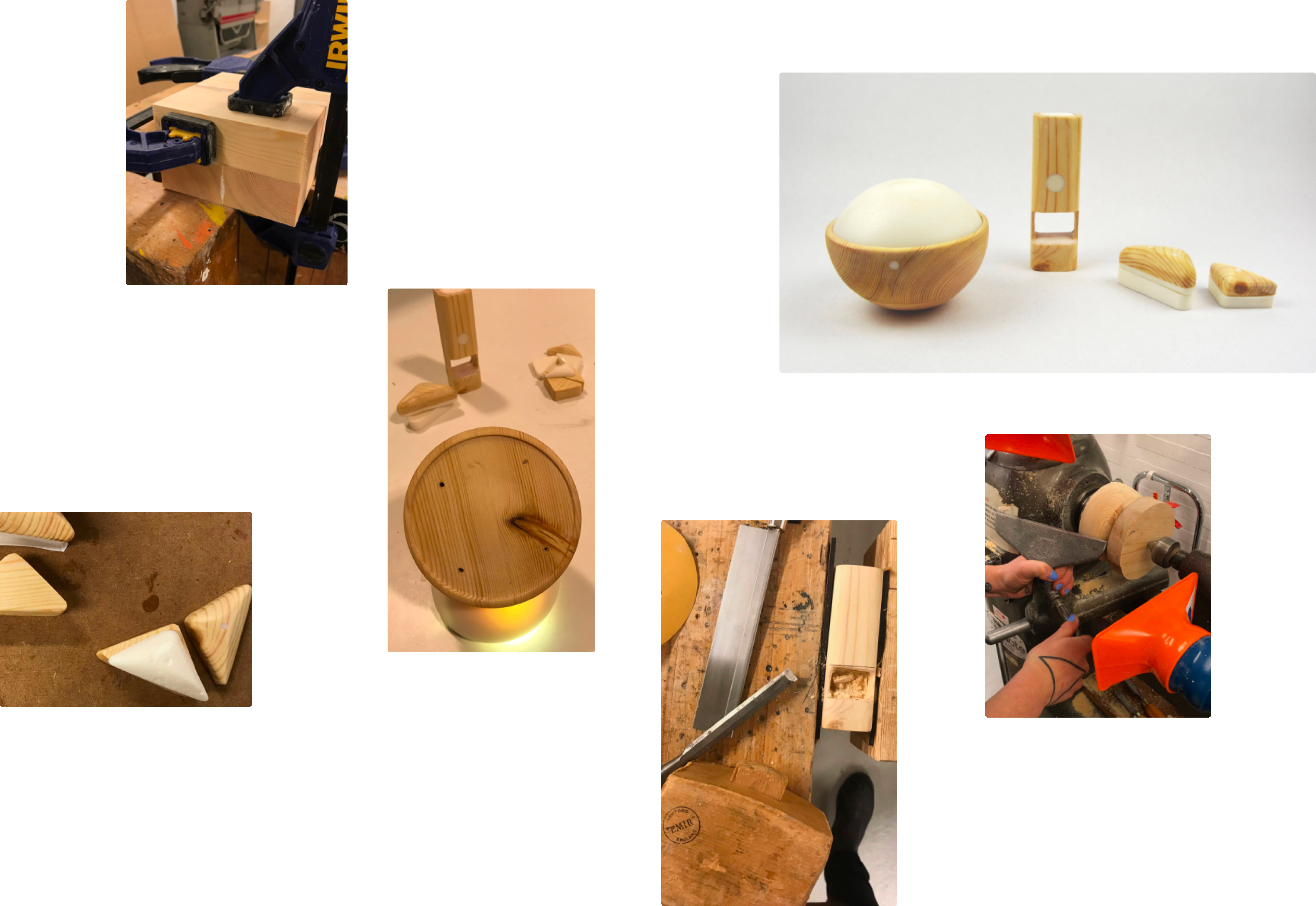
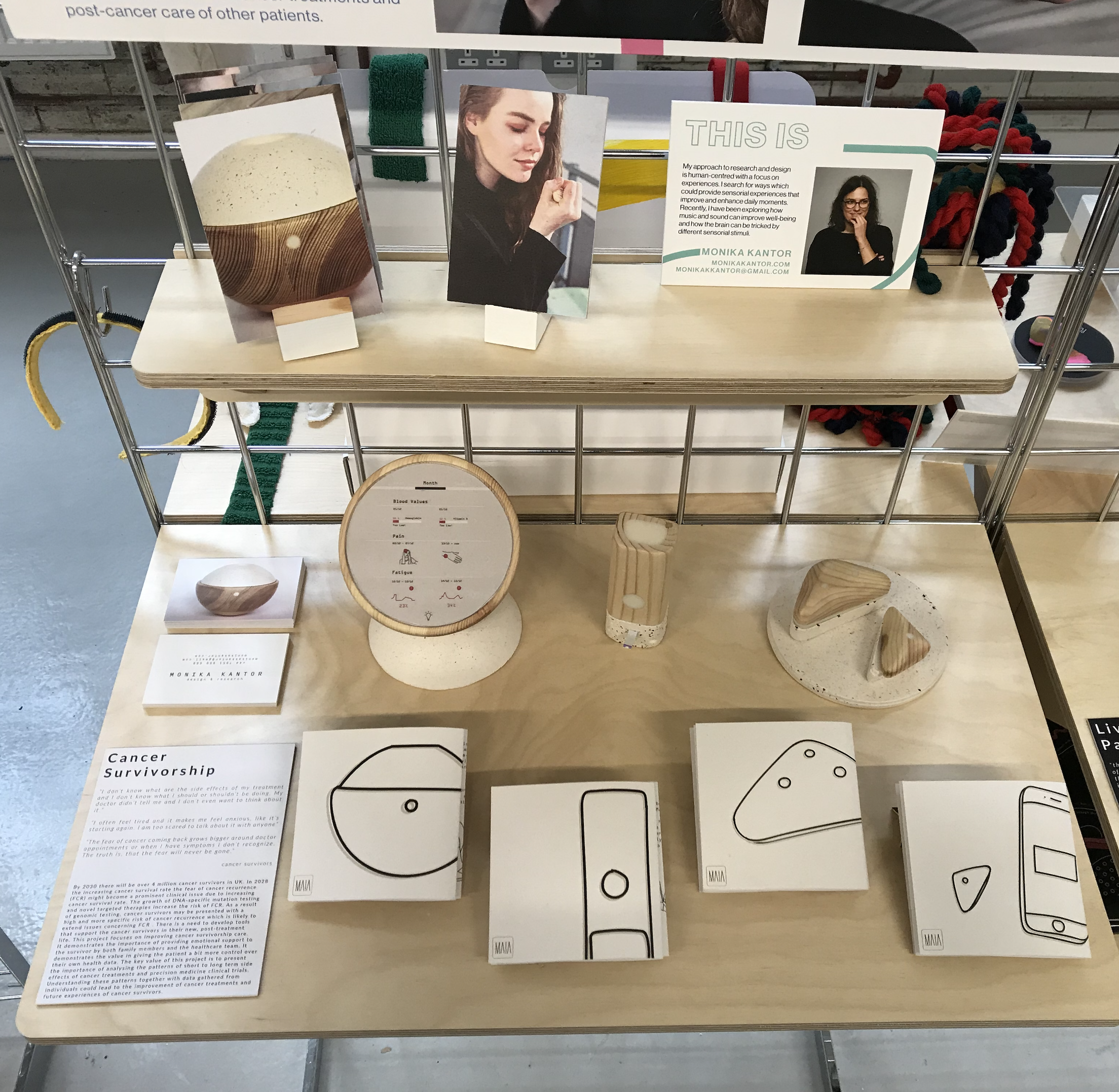
The Maia device family — turned wood and resin prototypes. Objects designed to be near you, not surveilling you.
The brief
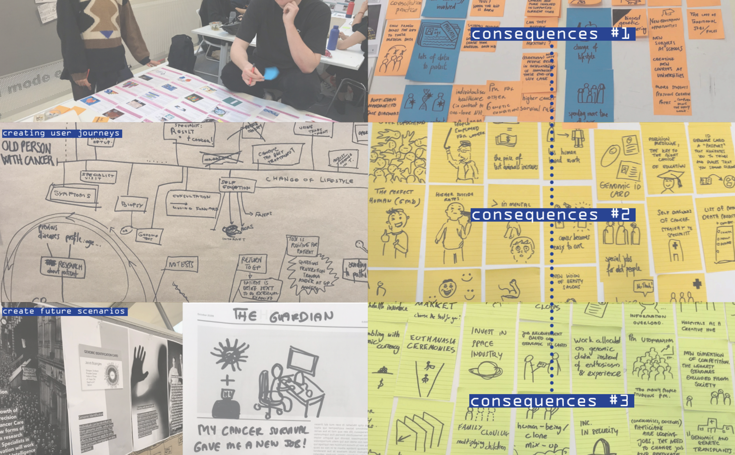
This was a final-year project at Glasgow School of Art, in partnership with the University of Glasgow Clinical Innovation Zone — a precision medicine research centre embedded inside a working hospital. The brief asked us to envision a future cancer care landscape ten years ahead, then design artefacts, services, and experiences for people who might live within it. It ran across sixteen weeks in two phases: a collaborative group phase building a shared future world through research, scenario development, and public exhibition; then an individual phase where each student chose a direction and developed their own design response. This wasn't a brief about designing a product. It was a brief about thinking seriously about human futures — and then making something that proved you had.
Research spread — consequences mapping workshop.
The problem I found
Precision medicine was transforming how cancer was diagnosed and treated, but survivorship care — the support available once treatment ended — had not kept pace. By 2030, there would be over four million cancer survivors in the UK. Fear of Cancer Recurrence was emerging as a documented clinical issue with a clear demographic pattern — younger survivors, women, and those with higher education were statistically more likely to experience it, and statistically less likely to receive adequate support for it. The people most aware of their risk were the least served by the system. Post-treatment support in 2018 was almost nonexistent. Treatment finished, appointments stopped, and patients were sent home with little guidance about what to expect physically, emotionally, or practically. The problem wasn't a missing feature. It was a missing phase of care entirely.
How I approached it
I treated this as a research problem before treating it as a design problem. Desk research across precision medicine and clinical oncology. STEEEPLE analysis mapping the future landscape across social, technological, ethical, and other dimensions. Competitive analysis of existing digital health tools. Direct engagement with oncologists, pathologists, a patient representative, and two cancer survivors. A futures design workshop with practitioner Santini introduced cascading consequences as a method — you generate first-order consequences of a research finding, then consequences of those, then a third layer, pushing into genuinely speculative territory. The pivot to post-treatment survivorship came from the primary research itself. Research Participant #2 — a real cancer survivor I interviewed — had been diagnosed with leukaemia as a teenager. Her treatment lasted two years. When it ended, her doctor didn't show up for her final check-up. A stranger told her to drink water and exercise. She was given no information about what symptoms to expect, what side effects were normal, or what to watch for. Years later, sitting in a restaurant, the sight of food triggered a memory of a painful procedure from her treatment. She had become, in her own words, a little hypochondriac — anxious every time she got tired or had a headache, because that is exactly how her cancer had started. That interview didn't inform the design. It became the design brief. Clinical research confirmed what the interviews showed: younger survivors were statistically more likely to develop FCR and less likely to receive adequate support. When all three sources pointed to the same gap, I stopped broadening and committed.
#1
Research Participant
Cancer survivor. Described the information vacuum that followed the end of treatment — no guidance on what came next, physically or emotionally.
#2
Research Participant
Patient representative and cancer survivor who had navigated multiple clinical trials. Articulated fear of recurrence with a specificity that felt like a design brief in itself.
FCR
Core Insight
Younger survivors were statistically more likely to develop FCR and less likely to receive adequate support for it. The gap was documented. Nothing was filling it.
The governing principle
Maia reduces the cognitive and emotional burden of survivorship by making the invisible visible. Fear of recurrence is largely driven by uncertainty — about symptoms, about data, about what is normal. Every element of the system needed to reduce a specific form of that uncertainty. Maia does not diagnose. It does not replace clinical follow-up. It monitors, records, shares, and guides — but authority always sits with the care team and the survivor. The research showed that one of the deepest fears survivors have is losing control of their own health narrative. Every boundary I set was designed to protect that control, not erode it.
The device ecosystem
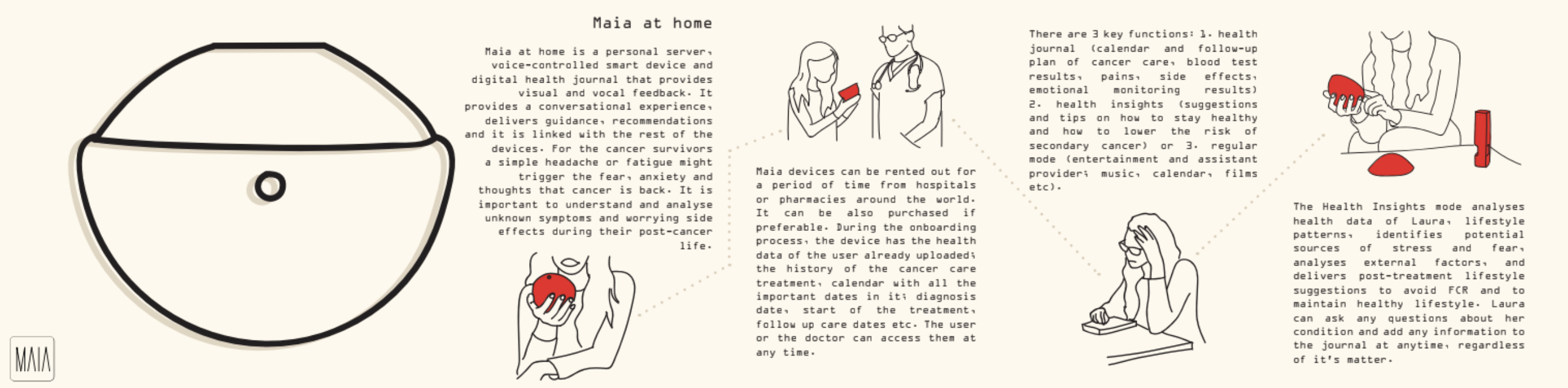
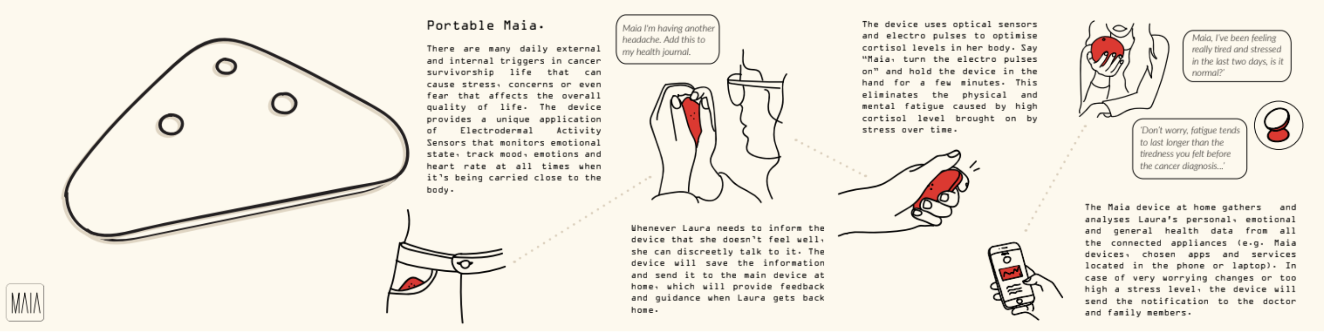
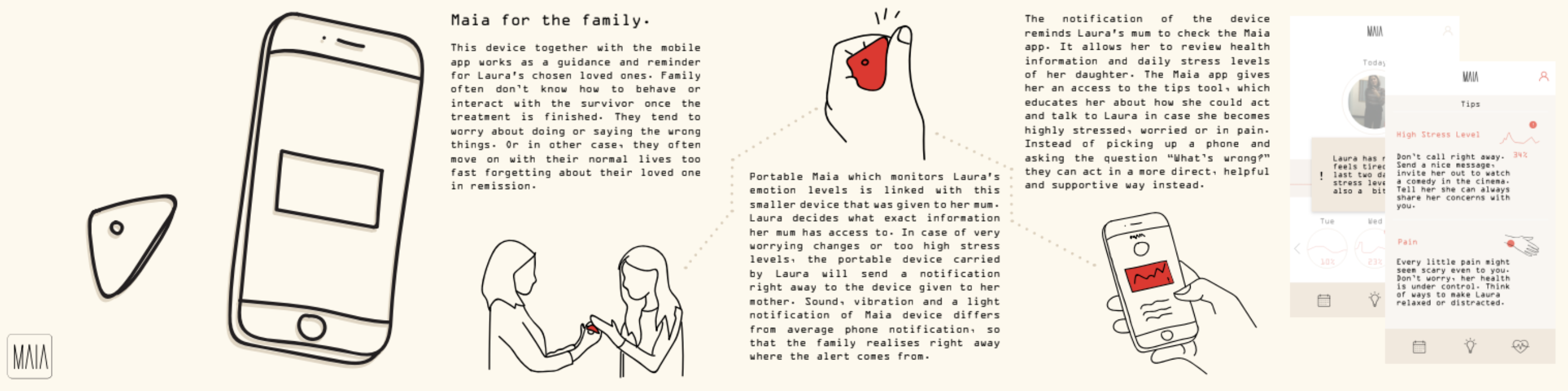
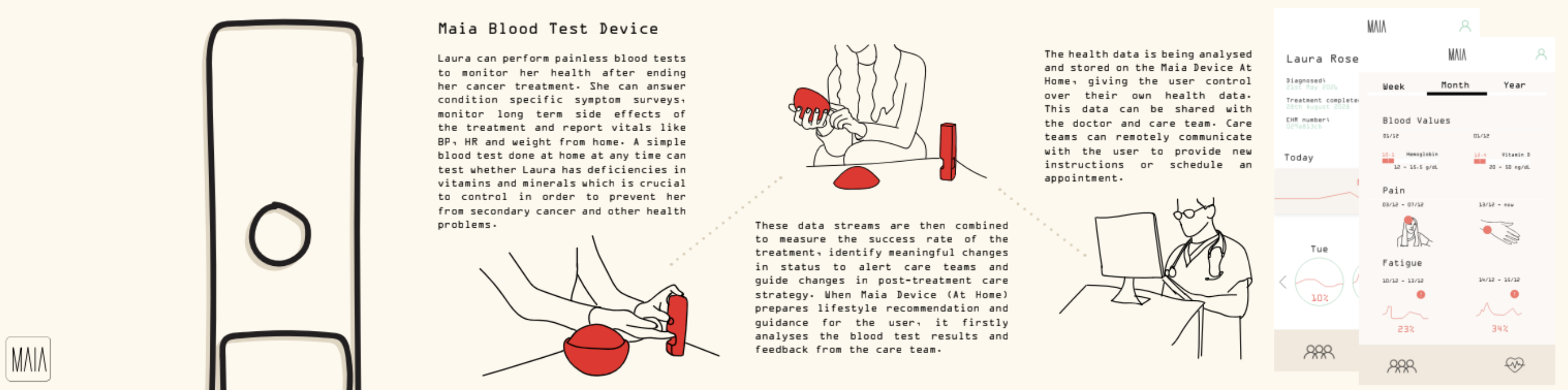
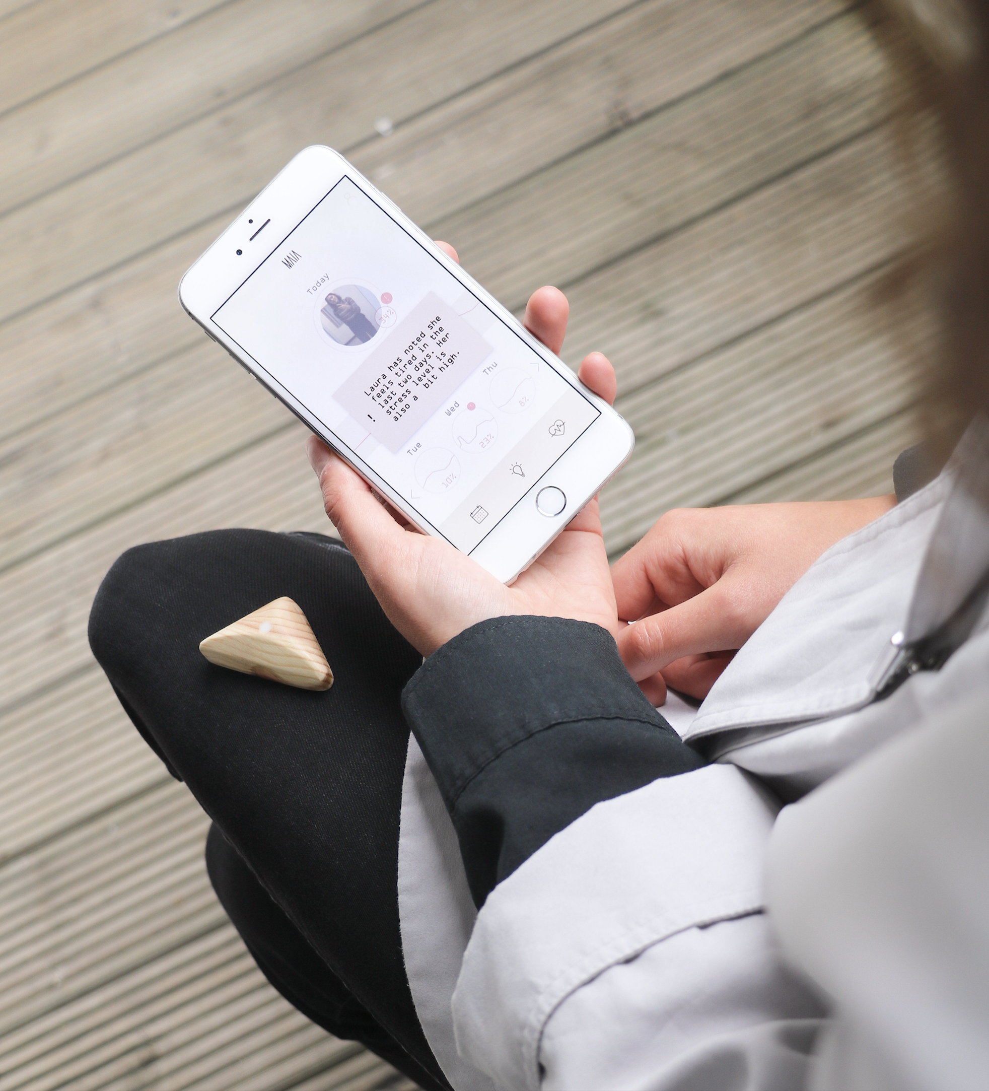
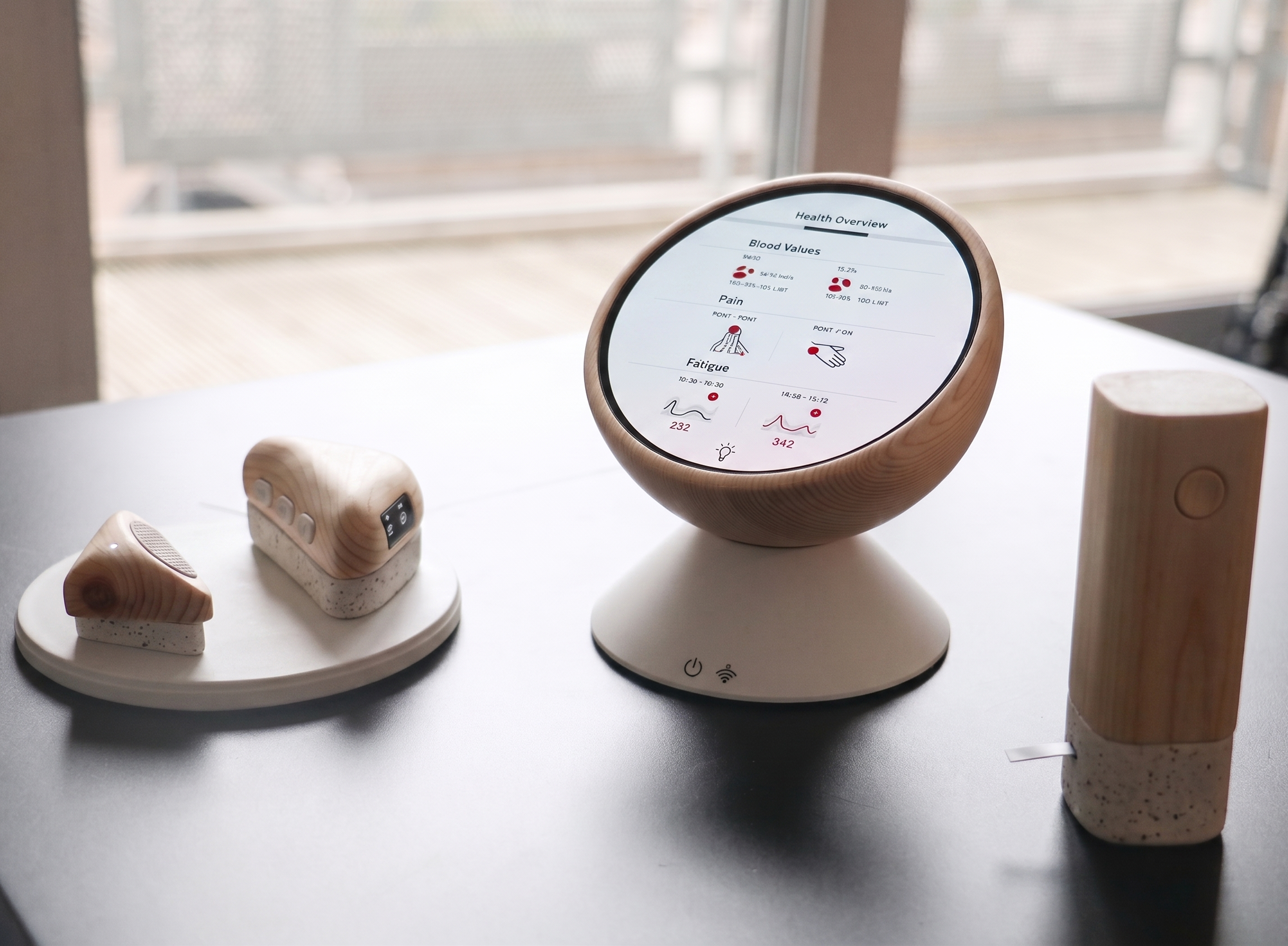
I designed a family of devices rather than a single product because FCR manifests differently depending on where you are — at home processing health data, out in the world when an unexpected symptom appears, in a moment of high stress with no one to tell, or surrounded by a family that wants to help but doesn't know how. A single device would have forced a compromise across all four contexts. Four devices, each resolving a specific failure point, was the only architecture that made sense. Maia at Home is the central hub — a voice-controlled personal server and health journal that holds the survivor's complete treatment history, connects to the care team, and provides lifestyle guidance based on the survivor's own data. It answers the question the doctor often never did: what should I expect, and what does this symptom mean? Portable Maia is for the world outside the home. Cancer survivorship is full of unexpected triggers — a smell, a feeling of fatigue, a headache that might mean nothing or might mean everything. Portable Maia monitors emotional state and heart rate continuously using electrodermal sensors, and lets the survivor log symptoms and concerns discreetly in the moment. Everything logged feeds back to the home device. The survivor is never alone with a symptom they don't understand. The Blood Test Device removes one of the most anxiety-provoking moments in survivorship — waiting for a clinical appointment to find out if something is wrong. At-home blood testing lets the survivor monitor vitamin deficiencies, haemoglobin levels, and key health markers on their own timeline. Results go directly to the care team. The waiting disappears. Maia for the Family addresses a gap that came directly from the research: survivors repeatedly described a world that moved on around them while they were still afraid. Family members wanted to help but didn't know how — worried about saying the wrong thing, or moving on too quickly. The family device is shared only at the survivor's explicit consent. It notifies a chosen loved one when stress levels become unstable — not with raw data, but with a prompt and specific guidance on how to respond. It turns passive concern into informed, actionable support.
Hand-building the device family. Wood shaped and turned, details cast in resin.
01
Maia at Home
Voice-controlled personal server and health journal. Conversational guidance, lifestyle recommendations, emotional monitoring.
02
Portable Maia
Wearable device monitoring emotional state and stress using electrodermal sensors. Always present, never intrusive.
03
Blood Test Device
At-home testing with clinician data sharing. Removes the anxiety of waiting for appointments to learn if something is wrong.
04
Family Device
Gives loved ones guided access to the survivor's emotional state, with specific tips on how to respond — not just awareness, but guidance.
01 — Maia at Home
02 — Portable Maia
03 — Maia for the Family
04 — Blood Test Device
The system purpose
The four devices weren't designed to work in isolation from the wider health system. Together they form a longitudinal data ecosystem. Survivorship data collected across devices — symptoms, emotional states, blood values, side effects both known and unknown — can be shared with care teams and fed into precision medicine research. The patterns that emerge from survivors logging the same unexpected fatigue, the same moment of fear, the same blood deficiency at the same stage of recovery, are currently invisible to clinical researchers. Precision medicine in 2018 had no systematic approach to understanding short, medium, and long-term side effects post-treatment. Maia was designed to make that data collectible, legible, and useful — not as a secondary benefit, but as a core purpose. The survivor managing her fear of recurrence at home is simultaneously contributing to the clinical knowledge that will make the next survivor's experience better. That dual purpose — personal support and collective knowledge — was the reason an ecosystem approach mattered more than a single well-designed product. The project was recognised by the head of the Clinical Innovation Zone as the most clinically significant work in the cohort. Every other student had focused on designing for diagnosis or active treatment — the phases precision medicine was already investing in. Post-treatment survivorship was the untouched space. Her assessment was that it was also the most valuable for the future of precision medicine itself: the missing phase where longitudinal patient data could be collected, patterns in long-term side effects identified, and future clinical trials meaningfully improved. That recognition mattered not because it validated the design, but because it confirmed the research had found a real clinical gap — one that experts in the field hadn't yet solved.
Maia app interface. Data made legible without clinical coldness.
Final prototypes — technical components and working interfaces.
Honest limitations
This was speculative design, which means I had no real users in 2028 to test with — every decision was grounded in the best available evidence from 2018, and some of what I designed will turn out to be wrong when tested against real survivors at scale. Working on this project was personally difficult in ways I didn't fully acknowledge at the time: three close family members had been diagnosed with cancer in the previous year, and two of them died during the project, giving the research an urgency I couldn't have manufactured — but also making it harder. The interface remains underdeveloped relative to the system logic. The physical prototypes and interaction storyboards communicate the concept clearly, but the digital experience doesn't yet reflect how different survivorship is across cancer types. A 19-year-old recovering from leukaemia and a 55-year-old recovering from breast cancer are navigating fundamentally different post-treatment landscapes that Maia doesn't yet account for. Speculative design at this scale and timeline didn't allow for that depth — but a second iteration would start there.
The exhibition
The work was exhibited at Glasgow School of Art and subsequently in London. At both exhibitions, strangers — people unconnected to the school, unconnected to the brief — stopped at the work and spoke to me directly about their own experiences of cancer, their own fear, their own post-treatment isolation. They weren't evaluating a design concept. They were recognising something true. That response proved the research had reached something real — not that the design was correct, since speculative work can't be proven correct, but that the direction was worth pursuing. The honest limitation of this work is that speculative design can prove a direction without proving a solution. But the direction it points to — passive longitudinal data collection, at-home diagnostics, care ecosystems that extend beyond the clinical appointment — is more relevant now than it was in 2018. What precision medicine still lacks is a holistic approach to what happens after treatment ends. Maia was an early attempt to design that missing phase. What I'd build next isn't a more refined version of the devices. It's a clinical pilot: one cancer type, one hospital, three survivor profiles, real longitudinal data, real care team integration. The speculative work established what matters. The next step is proving whether it works.
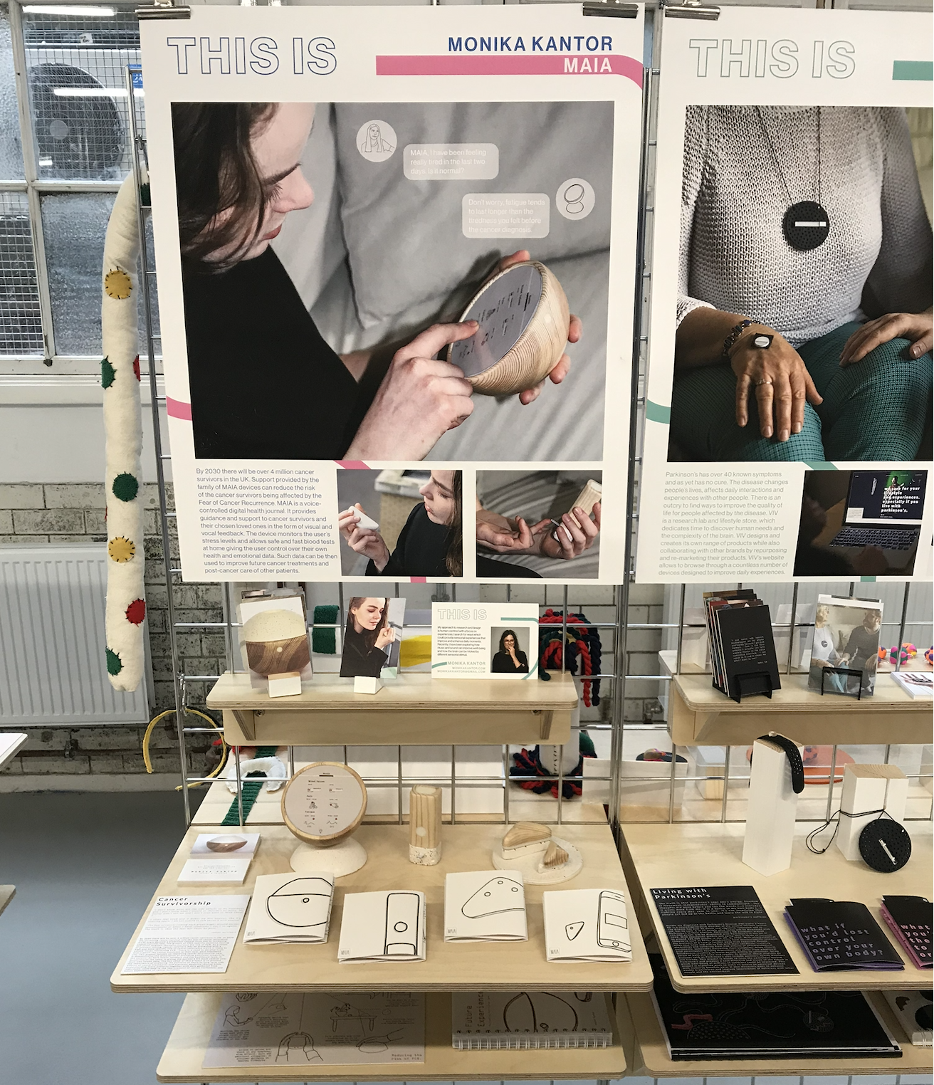
The full exhibition stand at Glasgow School of Art — devices, research posters, and interaction cards.
The device family displayed in context — the whole system visible at once.
What I'd do differently
Go deeper on personalisation by cancer type. The fear of recurrence, the side effects, the post-treatment support needs — these vary significantly depending on the cancer, the treatment, and the age of the survivor. The current system treats survivorship as broadly uniform when it isn't. If I returned to this project I'd design distinct user journeys for at least three survivor profiles and develop the interface to reflect those differences properly — not as an aesthetic decision, but as a clinical one.
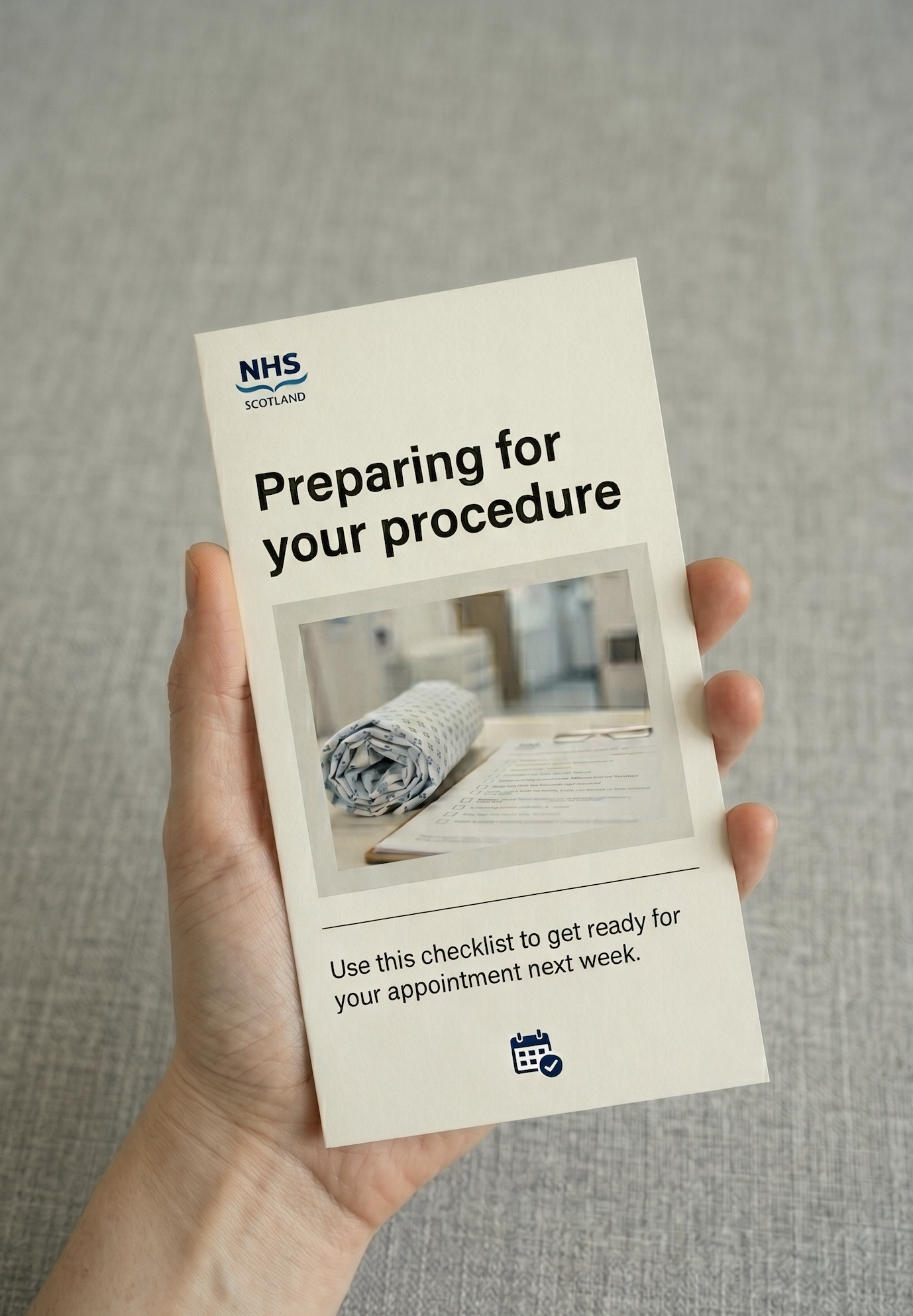
NHS Scotland
GSA × NHS LothianService Designer
Edinburgh2017–2018
The story
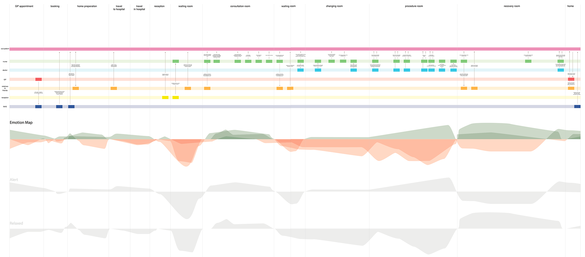
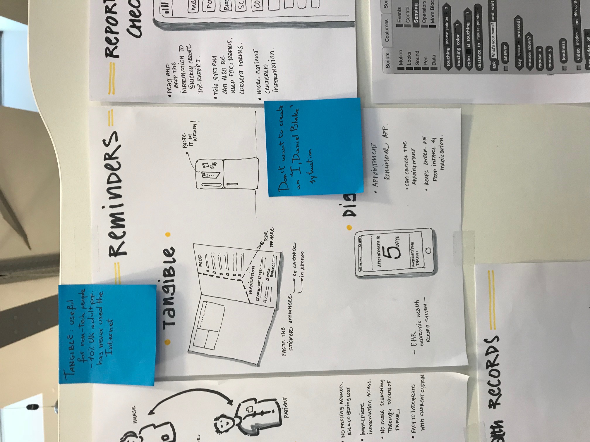
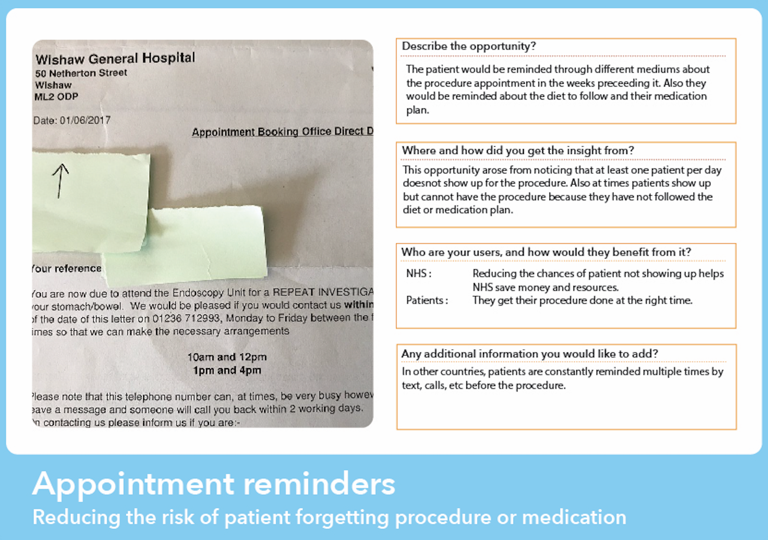
7 out of 27 appointments at the Royal Infirmary of Edinburgh Endoscopy Unit were no-shows. The NHS knew. Nobody had fixed it. Two days of ethnographic research told us exactly why: patients arrived overwhelmed, underprepared, and frightened — because every piece of communication they'd received was dense text nobody read. I was the only one who followed a single patient through the entire journey, from reception to recovery. That close observation became the foundation of everything that followed.
The patient journey map built from two days of field research inside the Royal Infirmary of Edinburgh Endoscopy Unit.
The brief
In collaboration with NHS Lothian, the brief was to explore the terrain of endoscopy services and experiences within the Royal Infirmary of Edinburgh. The starting point was simple: understand the present situation, then develop new design opportunities and strategies. The team began with two days of field research inside the Endoscopy Unit itself — a group of us embedded in the hospital while others carried out desk research back at the studio. The field research was where the project found its real direction.
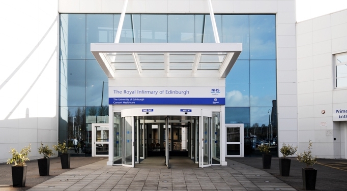
The Royal Infirmary of Edinburgh — where the two days of field research took place.
The research
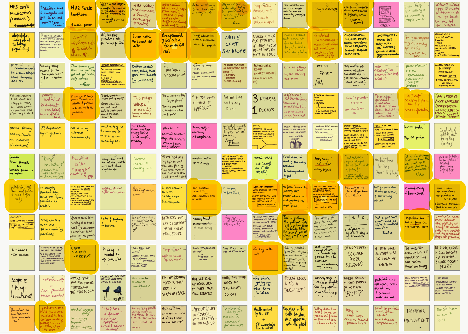
Standard shadowing and interviewing wasn't enough — I knew that going in. Endoscopy is an anxiety-provoking procedure, and the things patients don't say out loud tell you more than the things they do. Over two days I observed every room in the unit, watched multiple procedures from start to finish, and paid close attention to facial expressions, body language, and tone of voice. The most revealing decision I made was to follow one patient through their entire journey — from reception to the recovery room. I was the only person on the team who did this. Watching every handoff, every moment of waiting, every piece of paper handed over, made the systemic problems visible in a way that individual interviews couldn't. As a team of twelve, we pooled everything onto a shared patient journey timeline, then mapped emotions across each stage using Robert Plutchik's model. The emotional map showed anxiety peaking in the preparation room and procedure room — precisely the moments where patients had the least information and the least control.
Two days of field observation distilled onto the wall — sticky notes pooled across the team, organised into a shared patient journey timeline spanning every stage from reception to recovery.
Insights becoming ideas — early concept sketches developed directly from the emotional journey map and service map findings.
26%
Non-attendance rate
7 of 27 appointments were no-shows. The NHS knew. The causes were visible everywhere in the unit.
60k×
Faster — visuals vs text
Visuals are processed 60,000 times faster than text. The NHS patient system was built almost entirely on the format least likely to be retained.
20%
Written info retained
After two weeks. Compared to 50% of visual information. Every document I collected from the hospital failed this test.
The problem I found
The problem wasn't that the information didn't exist. The NHS booklet contained almost everything a patient needed to know. The problem was that nobody read it. I analysed every document collected from the hospital — the booklet, the consent form, the preparation instructions, the discharge letter — and marked every section that could be replaced with an image, a visual timeline, or colour coding. Almost everything qualified. The NHS was producing dense, clinical, text-heavy communication for patients who were already anxious, often elderly, sometimes facing literacy or language barriers, and who received everything at once — a week before a procedure they were already frightened of. The design opportunity wasn't a single feature. It was a complete rethinking of how the NHS communicated with patients across the entire pre-procedure journey.
Insights and opportunity card — translating field observations into a design-ready problem statement.
Concept card — one of the early ideas developed in response to a specific insight from the research.
How I approached it
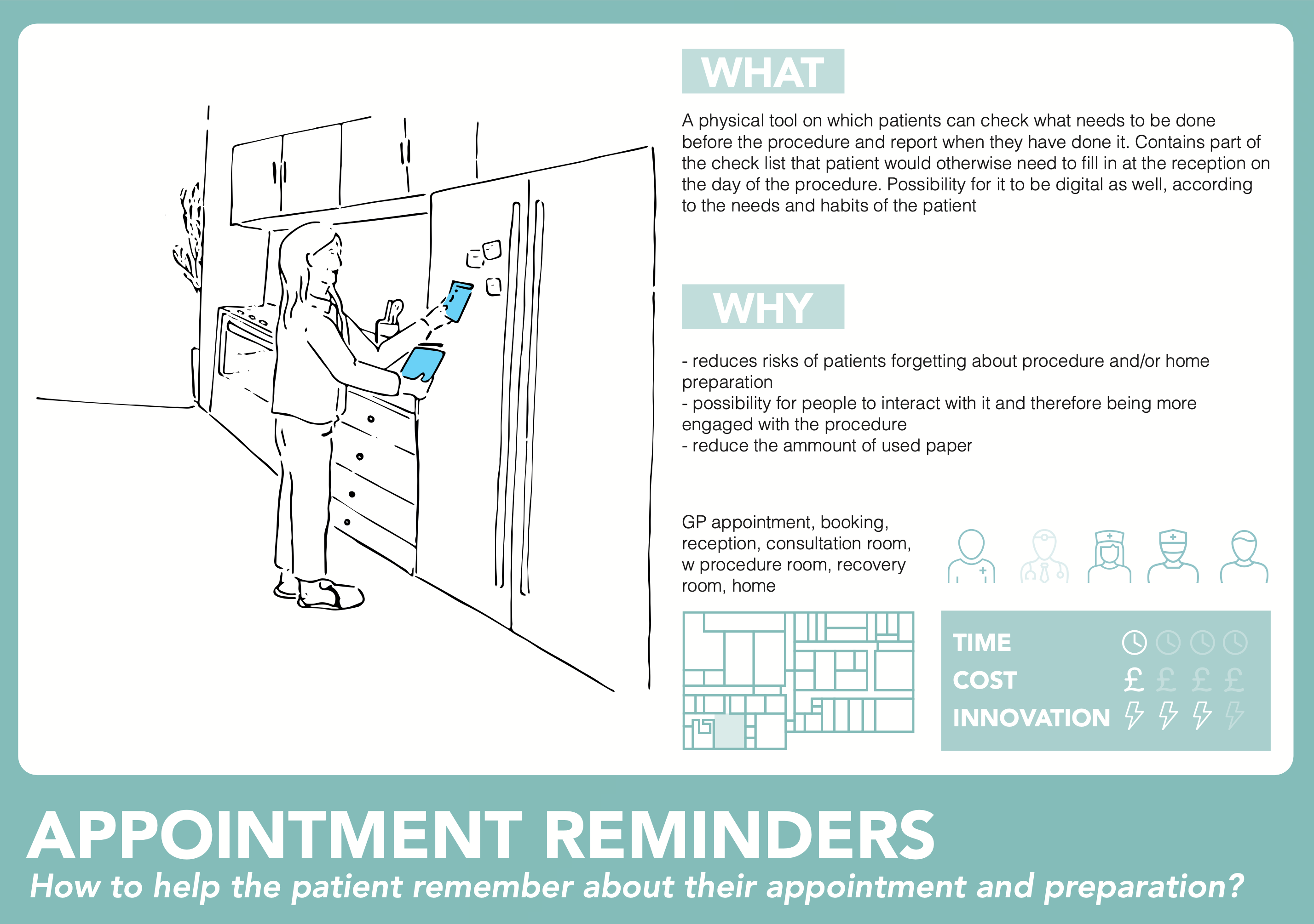
After the research and mapping phase, I focused on two questions from the evidence: how do we make sure a patient arrives physically and mentally prepared, and how do we make the information actually stick? The answer to both was the same — stop delivering everything at once. The existing brochure dumped all preparation information in a single document. I thought about the advent calendar: information revealed incrementally, day by day, creates engagement rather than overwhelm. That became the structural principle for the checklist. For the content that didn't fit the checklist — the contextual, explanatory, emotional material — I looked at what the research had shown about patient anxiety specifically. Patients were afraid of the unknown. Written text couldn't address that kind of fear. But audio could.
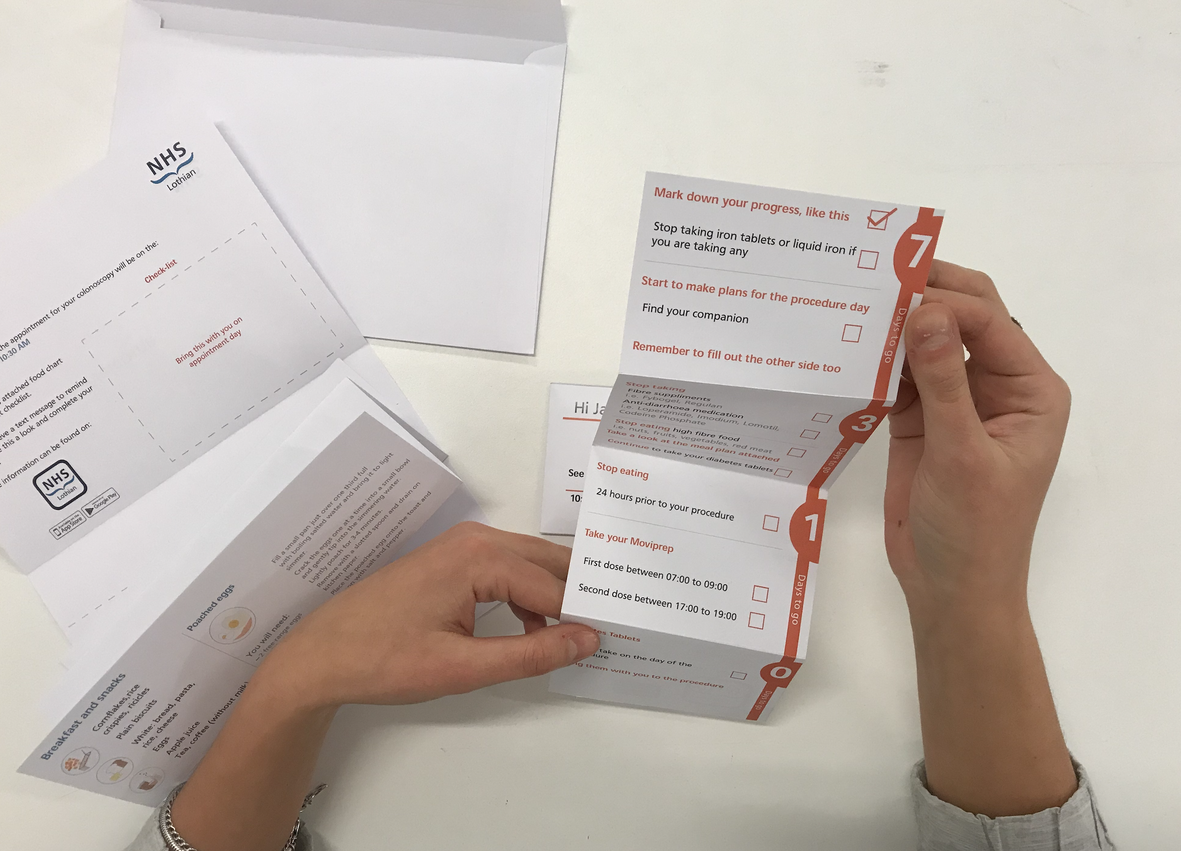
The colour-coded checklist unfolds across the week before the procedure — seven days out, three days, the day before, morning of. One manageable step at a time.
The back of the checklist: a personalised meal plan and a personal details form — completed calmly at home, not on a lap in the waiting room.
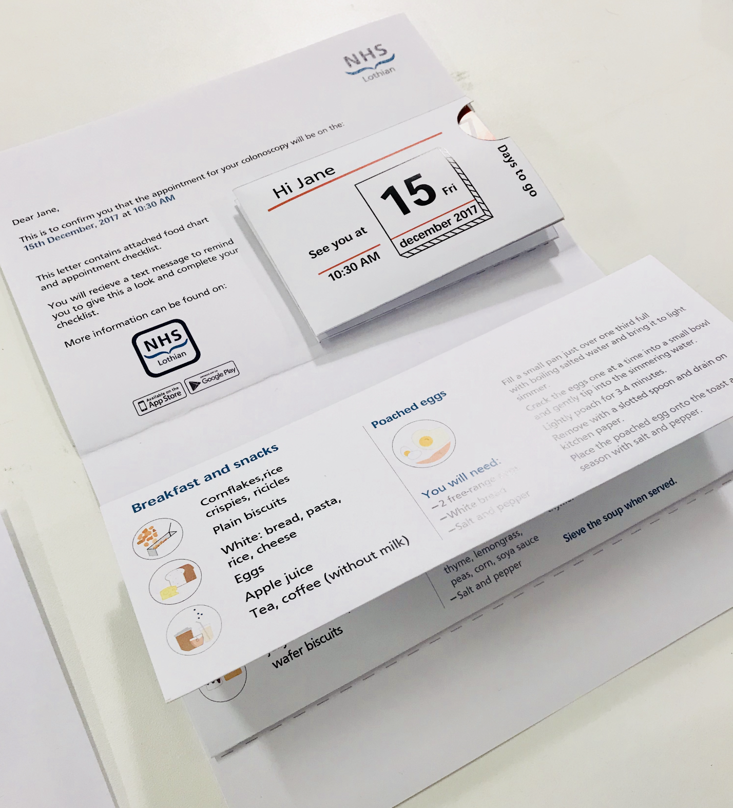
What I designed
The preparation checklist is a colour-coded, foldable document sent with the appointment confirmation letter. Blue for standard patients, yellow for Type 1 diabetes, orange for Type 2 — the colour coding happens at the booking stage, before the envelope is sealed. Each day reveals only the tasks relevant to that moment. The personal details form on the back — name, address, GP, next of kin, medications — is filled out at home, calmly, in advance. On the day of the procedure, the patient brings the completed checklist. No forms to fill out at reception. The checklist also includes a personalised meal plan: not just a list of what's allowed, but actual recipes for the days before the procedure.
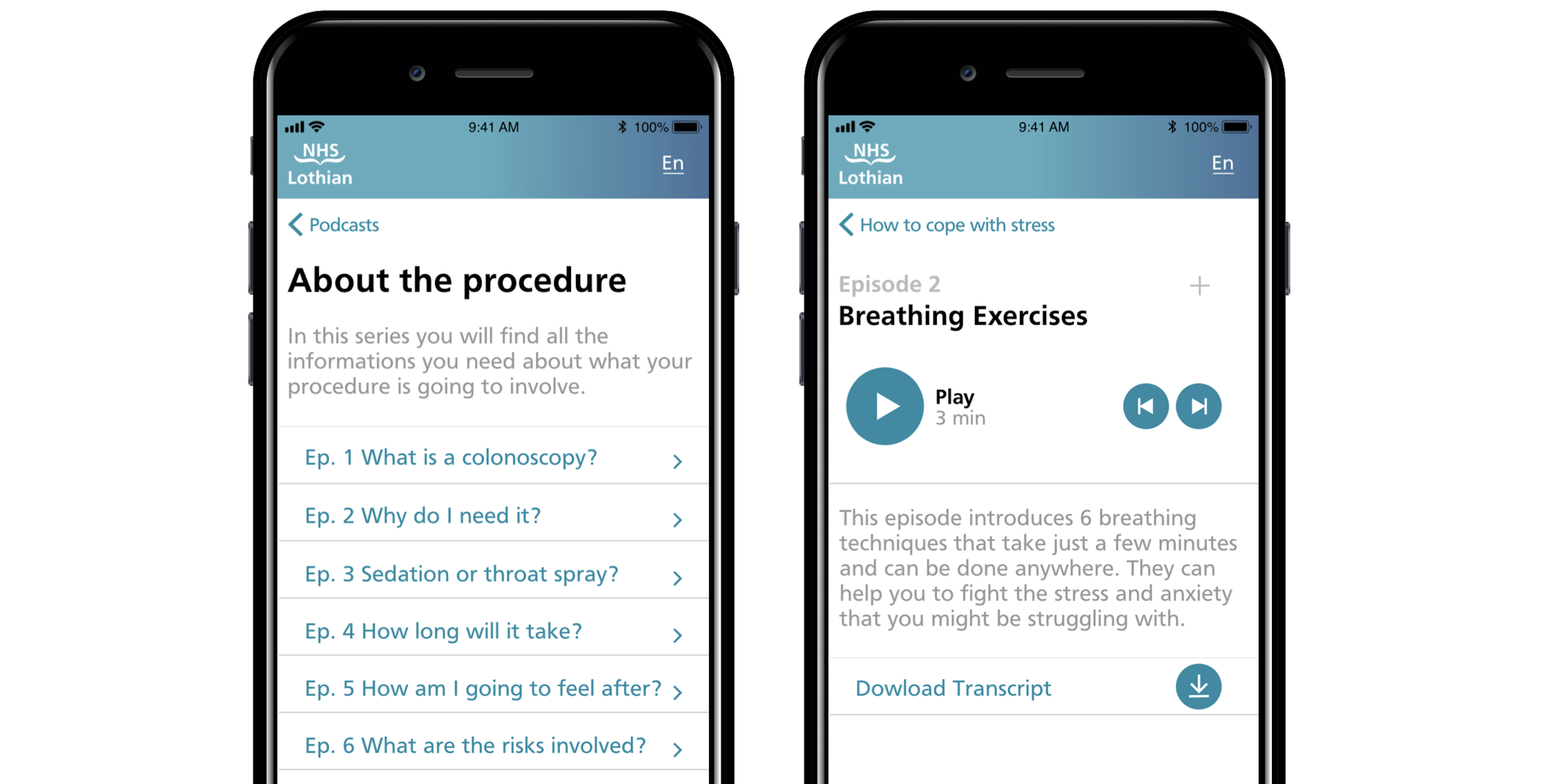
The NHS podcast app covers everything the checklist doesn't. Three categories: about the procedure (what it actually is, who will be in the room, how long it takes), how to cope with stress (breathing exercises, meditation, music therapy), and hear it from former patients. I designed and prototyped the full interface in Proto.io and Adobe XD, mapping the information architecture from the brochure analysis through to every episode of content. The app is personalised to the specific procedure — a patient booked for an upper endoscopy sees different content than one booked for a colonoscopy.
The NHS podcast app: home, procedure information, and stress relief content — prototyped in Proto.io and Adobe XD.
The hardest decision
The research had surfaced something I wanted to design that never made it into the final output: a patient choice form. Not a preference survey, but a genuine decision-making tool giving patients agency over what happened during their procedure — whether they wanted the doctor and nurse to talk them through what was happening, or preferred silence. Whether they wanted music. Whether they wanted an eye mask or ear plugs. This came directly from observation: I watched patients who clearly wanted reassurance get silence, and patients who looked overwhelmed by noise get conversation. The procedure room treated every patient identically. The research showed they weren't. The group didn't pursue it. I still think it was the strongest idea in the project.
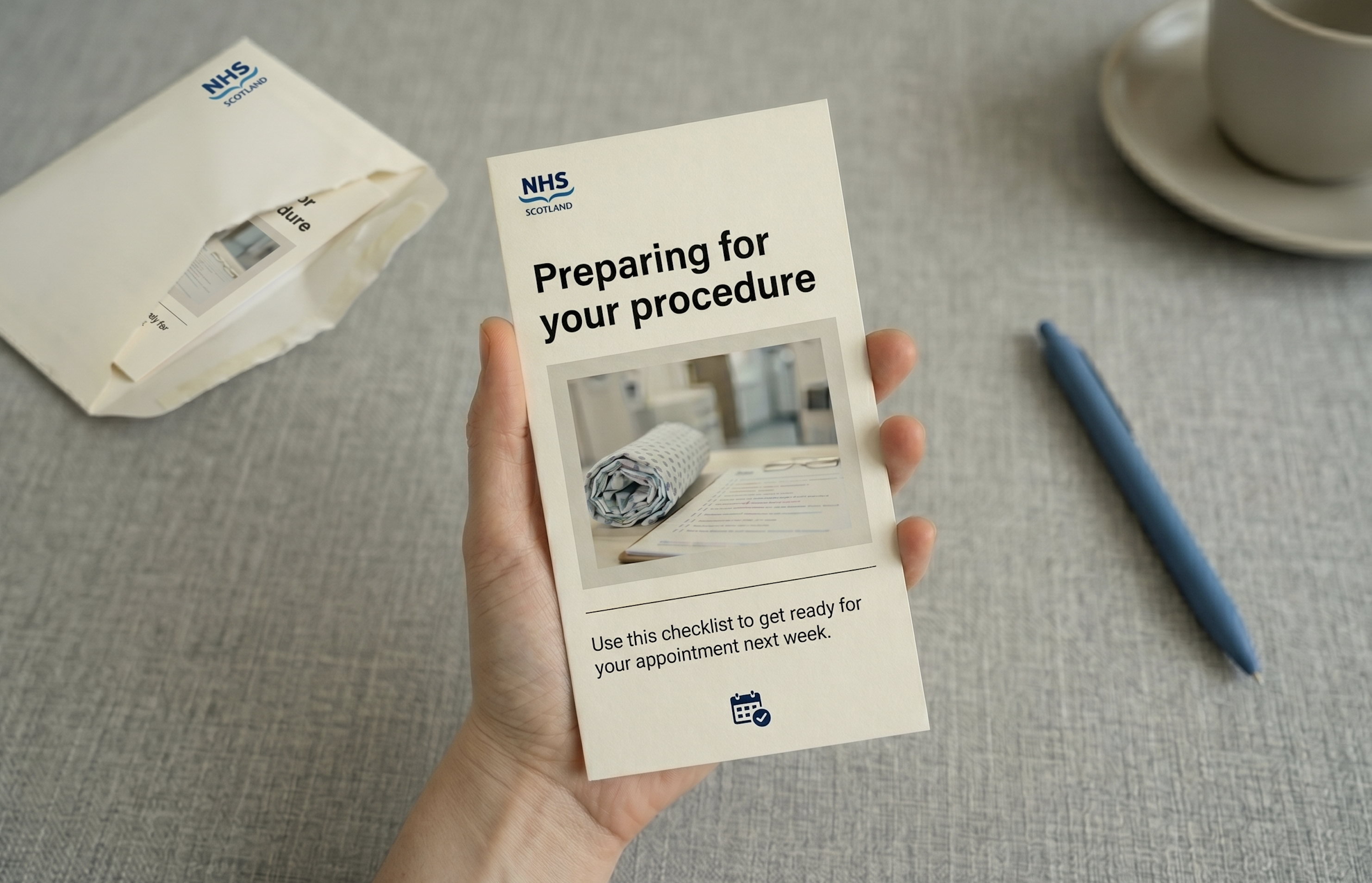
A step beyond the prototype — the preparation leaflet as a finished, physical object.
Tradeoffs
I traded visual polish for systemic completeness. The checklist and app prototype communicate the concept clearly, but the visual design was done under time pressure and doesn't reflect how I'd finish it for a development handoff. The structure and logic are sound. The aesthetics are a first pass.
I tested the checklist with people in the studio rather than real patients. The feedback improved the layout, but it didn't replicate the actual conditions of use — someone anxious about a medical procedure, reading alone at home, possibly with poor eyesight. The podcast app remained a concept prototype. The episode structure is detailed, the interface fully mapped — but only one audio episode was produced. What ships isn't the idea. What ships is the evidence that the idea is worth building.
What I'd do differently
Push harder for the patient choice form — giving patients real agency over what happens during the procedure itself, not just how they prepare for it. It came directly from two days of watching patients in the procedure room. Some wanted conversation and reassurance. Some wanted silence. The system treated everyone the same. A simple pre-procedure preferences form would have addressed anxiety at its most acute point. It was the most specific, most research-grounded idea in the project. It should have been in the final output.
Lyrics Feature
SpotifyProduct Designer II
TVs, Desktop & Other Large Screen Devices2019–2022
The story
Lyrics had been one of the most requested features in Spotify's history. I owned every large-screen platform. One other designer owned mobile. Between us, we had to make coherent what millions of people had been waiting years for — and nothing in the existing TV design language applied. Everything had to be invented from scratch.
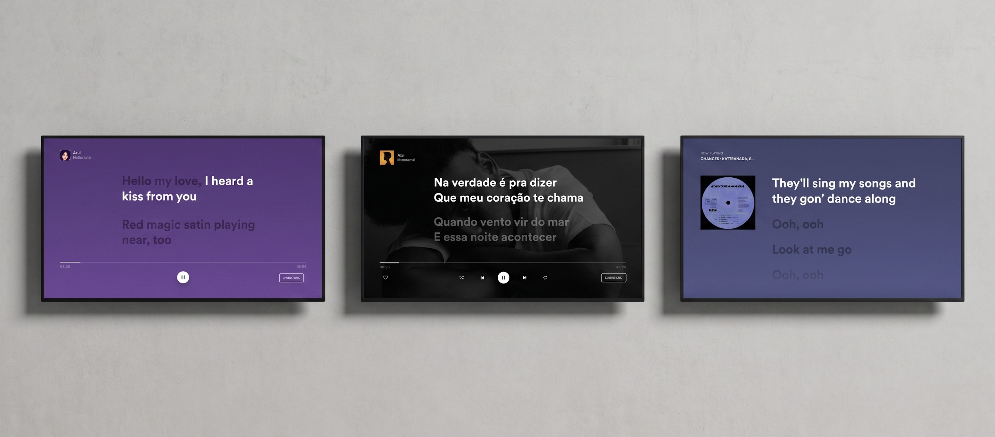
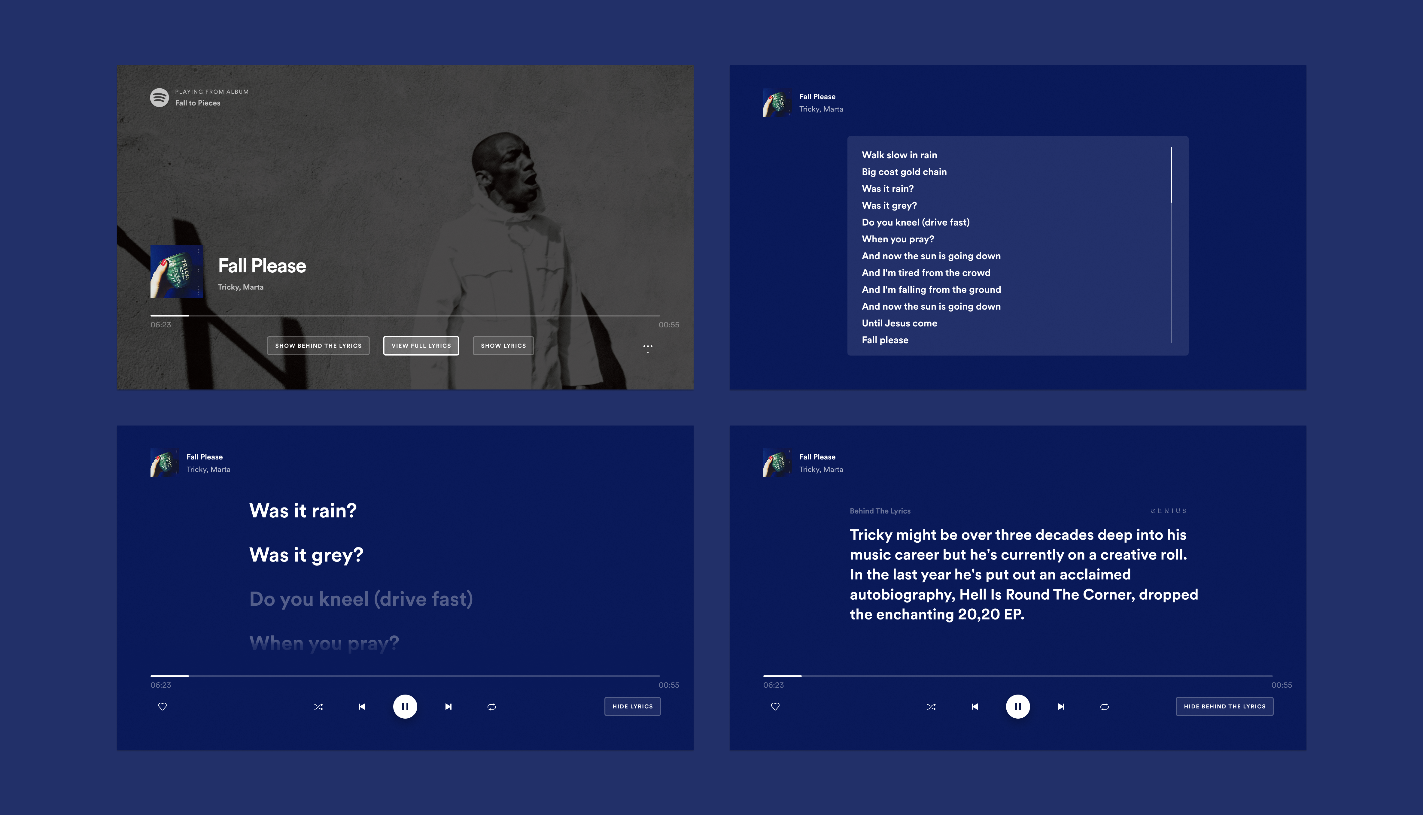
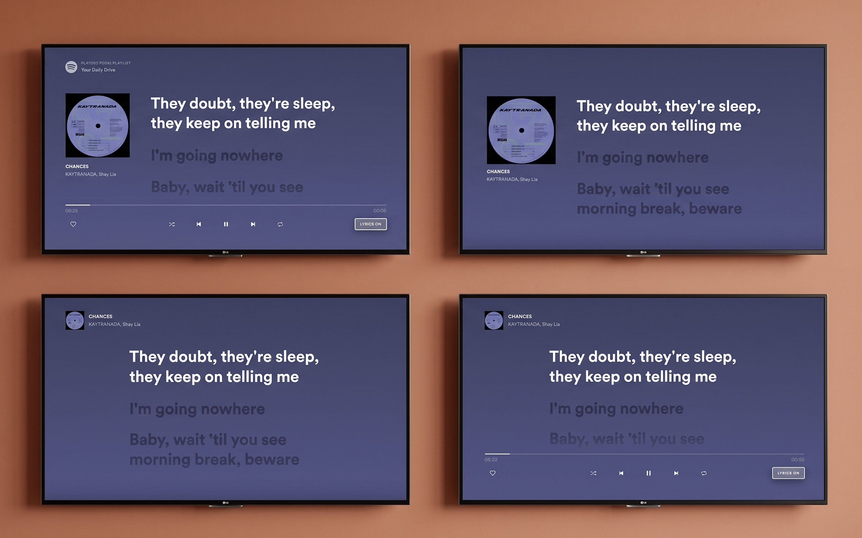
Lyrics on TV. Colour extracted from the album artwork. Artist image removed. Lyrics as the primary element on screen.
The context
Between 2019 and 2022 I was the lead designer for the Spotify TV app — a platform with over 42 million monthly active users across smart TVs, gaming consoles, cast-enabled devices, and low-end hardware with severe performance constraints. Designing for TV is a fundamentally different discipline from mobile or web. Users sit three to five metres from the screen, navigate entirely via remote control, and often share the experience with others in the room. Every decision had to account for viewing distance, remote click logic, multi-user scenarios, and the vast range of technical capabilities across dozens of device types. When the lyrics project landed, it wasn't a straightforward feature addition. It was a cross-platform systems challenge — with TV at its most complex end.
Early explorations — finding where lyrics live within the Now Playing View and how the TV-specific interaction model should behave.
The problem
Lyrics had been one of the most requested features on Spotify for years. Competitors offered them. Social media was full of users asking why Spotify didn't. An internal A/B test as far back as 2019 had already confirmed both the demand and the engagement signal. The feature couldn't ship until it was coherent across every platform simultaneously — mobile and TV had to move together under a unified vision that respected each platform's distinct context. I owned all large-screen platforms. The problem on TV specifically was harder than it looked. What works on mobile — scrolling text, tap interactions, portrait layouts — doesn't translate to a lean-back, remote-controlled, landscape screen watched from across a room. There was no existing pattern in Spotify's TV design language to build from.
How I approached it
I started with research and alignment before touching any design tools. Diary studies and user research had established that the core audience for lyrics wanted to follow along, understand the artist's meaning, and connect more deeply with the music — both alone and in group settings. I ran workshops with the design team covering past and current initiatives, moodboards, user journey mapping, and competitor analysis, with the analysis embedded in the sessions directly so the team could discuss strengths and weaknesses together rather than receive a report in isolation. Critically, I ran workshops with engineers before any design direction was committed to — because engineers know things about platform complexity that designers don't, and I wanted to surface technical risks before they became problems mid-design. One of the earliest architectural decisions to come from that collaboration was where lyrics would live: integrated into the Now Playing View, accessible only from within the app itself, with external entry points out of scope for this phase. That constraint shaped everything that followed.
Workshop session — competitor analysis and user journey mapping embedded together, not presented in isolation.
The hardest decision
The pivotal call was whether to keep the artist image in the background behind the lyrics or remove it entirely. The TV experience at Spotify had been built around rich artist imagery, so layering lyrics over that visual backdrop felt natural — but accessibility pushed back hard. Artist images behind text created contrast problems, cognitive load issues, and distraction, particularly for users with visual or cognitive accessibility needs. I made the call to remove the artist image from the background. That led immediately to the next question: how prominent should the album artwork be alongside the lyrics? I explored two directions — larger album artwork versus lyrics as the dominant element with artwork scaled back. The tight deadline meant there was no time for user testing to resolve it, so I took the decision to my closest design team — the people who had been through every critique and weekly review — and ran a structured voting session. The outcome was clear: lyrics as primary, artwork and song title as secondary. The background solution I landed on preserved visual richness without the artist image problem — colour extracted from the album artwork, built into multiple layers: a core colour, linear gradient, ten percent overlay, and noise texture, creating the contrast and depth needed for TV readability.
Wireframes exploring Now Playing View integration — where lyrics live, how they enter, how they exit.
Future explorations — directions considered for a second iteration beyond the initial launch scope.
The two directions presented to the team — artwork-forward versus lyrics-forward. The vote was unambiguous.
01
Colour extraction system
Background colour pulled from album artwork across four layers — core colour, gradient, overlay, noise texture. Visual richness without the contrast problems of artist photography.
02
Lean-back immersion
Five seconds after entering lyrics mode, surrounding UI components fade out automatically. A toggle in the bottom-right corner gives users control to enter and exit on their own terms.
03
Every edge case designed
Songs with no lyrics: toggle removed entirely. Unsynced lyrics: slow scroll on repeat. Four rotating empty-state messages written with the UX writer. Credits for Musixmatch.
What shipped
Lyrics as the primary focus of the screen. A fade-in effect allowing text to transition smoothly into new lines. A toggle button giving users control to enter and exit lyrics mode. Five seconds after entering, surrounding UI components faded out for lean-back immersion. Language variability was tested continuously throughout — not as an afterthought but as a live constraint — with multiple layout options evaluated across languages to ensure the design held across all 26 launch markets simultaneously. The groundwork for handover had been laid months earlier through workshops and design-tech check-ins, so developers had reviewed feasibility well in advance. Beyond the design work, I spent three days in workshops with Spotify's Global Marketing Lead and external agency Cubo developing the global launch assets — and that experience, seeing the scale of anticipation for the feature and shaping how it would be presented to the world, was one of the most significant moments of the entire project.
Language testing across 26 markets — a live constraint throughout, not a post-design check.
Every edge case designed. From left: unsynced lyrics slow-scrolls on repeat, no lyrics removes the toggle entirely.
Tradeoffs
I traded visual richness for accessibility — removing the artist image was the right call, but it meant letting go of one of the most distinctive visual qualities the Spotify TV experience had built. The colour extraction system is beautiful, but it's a different kind of richness. I traded user validation for momentum — the artwork versus lyrics-first decision was made without direct user testing, and the design team vote was a reasonable proxy given the constraints, but some of those decisions will be wrong for some users in ways the data will surface over time. And I traded experience depth for launch coherence — the feature shipped as a single experience across all contexts: alone or in a group, lean-back or engaged. That uniformity made the launch clean but left the most interesting design territory untouched.
What I'd do differently
I'd split the experience into distinct paths for distinct use cases — because lyrics and karaoke are not the same thing. A lean-back experience where you let the words wash over you is fundamentally different from an active, engaged, sing-along experience. A group TV session is different again from a solo one. The current design does one thing well. A second iteration would do several things deliberately — with different visual language, interaction logic, and entry flows for each. The TV version specifically would have distinct modes that reflect how people actually use their televisions, rather than treating every context as identical.
First Video on TV
SpotifyProduct Designer II
TVs & Large Screen Devices2020–2021
The story
Spotify signed Joe Rogan and had weeks to ship a video experience that had never existed on TV before — on a platform where our entire usability testing practice had just become impossible. I owned the second half of the project: every video-specific feature. That meant designing seeking behaviour from scratch, cinema mode, subtitles, and running the first remote TV usability study in Spotify's history.
Spotify's first video experience on TV — the Now Playing View adapted for long-form video content.
The context
Spotify TV had approximately 40 million monthly active users and zero video experience. The Joe Rogan deal changed that overnight. My colleague Mady led the initial phase — establishing the vision, workshops with the full Home CE design team, and the core layout. I took ownership of the second half: every video-specific feature. That meant seeking behaviour, cinema mode, loading states, the subtitles feature, the subtitle icon, and the research methodology that validated all of it. The team was small: two designers, a user researcher, engineers, a PM, and an EM. The platform constraints were severe. On TV you navigate with a remote. You sit three metres from the screen. Nothing from Spotify's existing design patterns transferred cleanly.
The problem
Spotify had no video patterns for TV. No seeking logic. No established cinema mode conventions. No subtitle component. And crucially: no way to test any of it with real users once the pandemic hit. The first thing I discovered when we examined the existing seeking behaviour — one button press equals ten seconds — was that it was completely broken for long-form content. Joe Rogan episodes run three to four hours. Seeking to the one-hour mark using 10-second increments would take 360 individual button presses. Nobody had stress-tested this against real content length. It was a fundamental design failure hiding in plain sight.
The 360-button-press problem: old fixed-increment seeking vs the new content-length-dependent three-bucket system.
01
Seeking behaviour
No TV platform Spotify supported had documented their seeking behaviour for designers. I ran a full competitor audit — Apple TV, Apple Music — across every state, remote type, and edge case before touching a Figma frame.
02
Testing without a lab
Pre-pandemic, TV usability testing meant a lab, a large screen, a remote. Covid made all of that impossible. I brought the full cross-functional team together to evaluate three approaches and establish a workable methodology.
03
Subtitles as a legal requirement
The legal team identified that Spotify must provide time-synced subtitles for accessibility compliance. This wasn't a product choice. It was a deadline with no existing pattern to build from — including a separate activation flow for TV Cast.
How I approached it
The scope of my ownership was broader than a single feature. I was responsible for every video-specific design decision across the experience: seeking behaviour, loading states, the side navigation menu, the full subtitles feature, the subtitle icon, and the visual design consistency across AndroidTV, Cast, and FireTV — platforms that vary significantly in screen size, rendering capability, and input method. None of these workstreams were isolated. Every decision in seeking affected how the NPV behaved. Every subtitle display rule affected what the side menu needed to communicate. And all of it had to work across platforms I couldn't physically test on during a pandemic — designing for a viewing distance of three metres on a screen I was previewing at 18 inches.
Seeking
Seeking had never been properly designed for long-form content at Spotify. I started with a full competitor audit — documenting scrubbing behaviours on Apple TV and Apple Music in detail, mapping navigation button vs media control button, inside-app vs outside-app, standard remote vs gaming controller. Then I ran a brainstorming session with engineers and the researcher, evaluated three solutions, and established hard requirements before opening Figma. The solution I designed introduced incremental seeking speed tied to content length — three buckets (under 10 minutes, 10–60 minutes, over 60 minutes) — so seeking never feels painfully slow on a 3-hour podcast or blindingly fast on a 5-minute clip. I also designed a bounce-back micro-behaviour: fast-forwarding to the very end triggers a return to credits rather than an abrupt session end.
Loading states
Loading states required designing for two tiers of hardware. High-end platforms got Spotify's animated Encore loading component. Low-end platforms — which couldn't handle animation reliably — got a static text fallback with three dots. I tried to avoid the Spotify indicator entirely so users wouldn't associate slowness with the app, but the platform constraints made that impossible. The fallback was a pragmatic compromise, documented for future improvement.
Subtitles feature
The subtitles feature had three distinct layers. First, the side navigation menu component — the settings entry point where users turn subtitles on or off, new to TV at Spotify. Second, the confirmation notification displayed on toggle, necessary because there may be no dialogue on screen at that moment, so without it users would have no signal their action had worked. Third, the actual subtitle display guidelines: maximum two lines of text, correct contrast ratio against unpredictable video backgrounds — requirements I derived from legal compliance documents and competitor research. I also designed a completely separate activation flow for TV Cast, which has no on-screen UI at all. Activating subtitles while casting had to be done through the mobile app — an interaction model that didn't exist anywhere in Spotify's patterns and had to be invented from scratch.
Visual design across platforms
Visual design across platforms meant designing for screens ranging from small cast devices to large living room TVs, with different safe areas, different font rendering, and different remote navigation patterns. I contributed to Spotify's TV design system by building a reusable library of font styles and typographic tokens — replacing hundreds of inconsistent styles across platforms with a coherent, documented system that designers could pull from Figma and engineers could implement in code.
The testing solution
Testing a TV experience during a pandemic meant every standard approach was gone — no lab, no large screen, no remote in a participant's hand, no moderator in the room. I treated this as a design problem in itself. I brought together two engineers and our user researcher for a brainstorm — two phases: diverge freely first, then filter each idea against how honestly it would capture real user behaviour and how much effort it would take to build. What struck me was how creatively playful engineers become when you give them the right container. That process was something I couldn't have run alone.
We landed on testing the live experience in a browser via screen share. Our user researcher gave us confidence it would hold: she confirmed that feature functionality, interaction flows, and UI comprehension could be tested reliably regardless of screen size — even if component sizing couldn't. That distinction let us design the study around what the method could honestly answer. I ran 12 participants across 3 days in October 2020 — 6 existing Spotify users, 6 new users, all in the US — producing high, medium, and low priority findings across discovery, NPV, and return flows. The high-priority issues alone reshaped Q1 priorities for the entire team.
Spotify's first remote TV usability study — 12 participants across 3 days, testing the live experience via browser screen share.
The subtitle icon
The usability study revealed that every single participant — all 12 — failed to identify the original subtitle icon correctly. They called it a comment button, an episode list, a description panel. The original icon was a simple rectangle with two horizontal lines. It meant nothing. I ran a competitor analysis across Netflix, Disney+, HBO, and Amazon Prime. All four used speech bubble variants. I ran 21 icon explorations — varying the speech bubble tail position, line placement, and line density — and tested 5 shortlisted candidates via UserTesting.com. The winning design moved text lines to the bottom of the frame, closer to how subtitles actually appear on screen, giving users an intuitive reference point. That icon was adopted into Spotify's design system and rolled out across platforms.
21 subtitle icon explorations. The winning design moved text lines to the bottom — closer to where subtitles actually appear on screen.
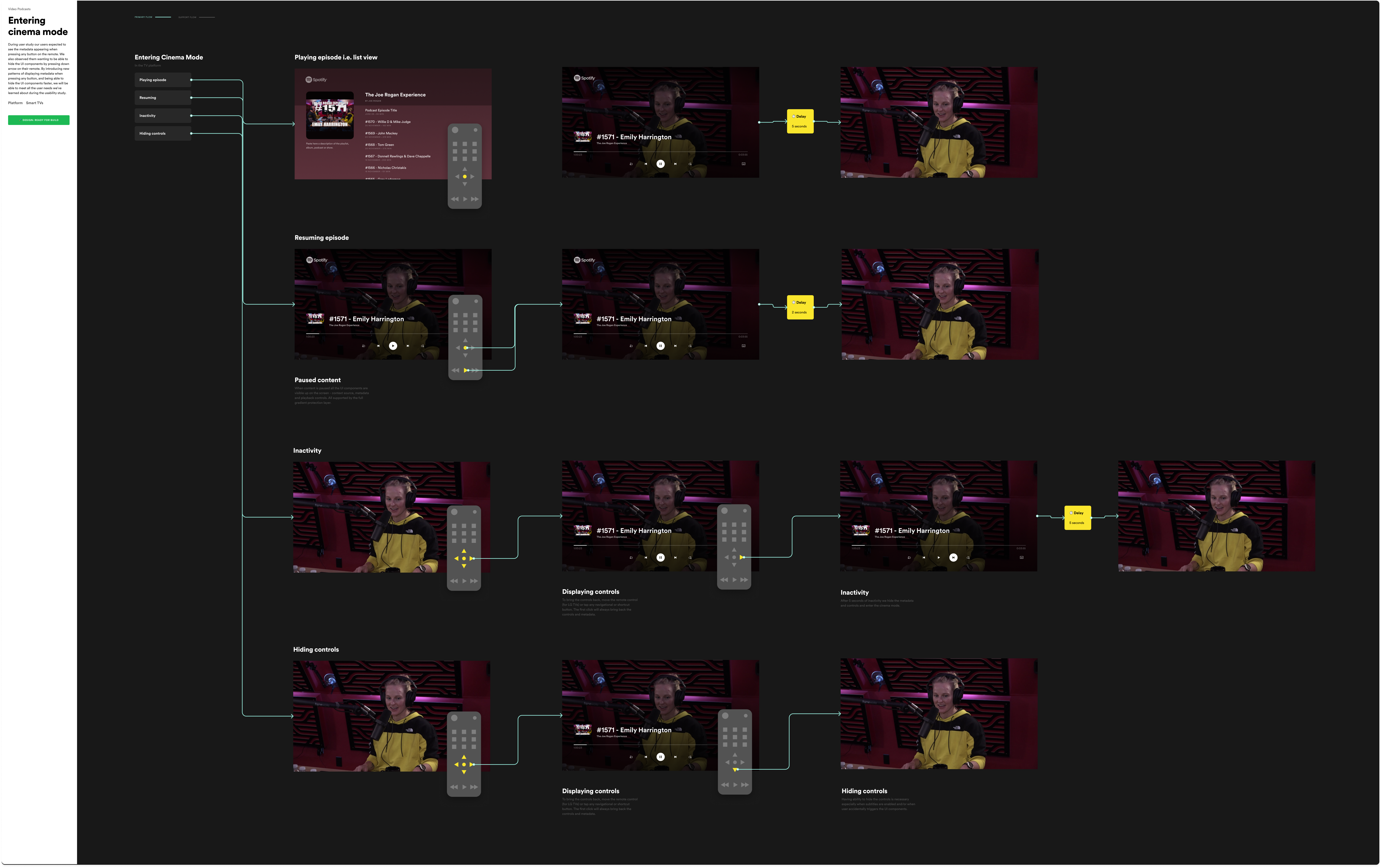
Cinema mode
The usability study surfaced a clear expectation: users wanted metadata to appear when pressing any button on the remote, and they wanted to be able to dismiss UI components quickly by pressing down. Spotify had no pattern for this. I designed a cinema mode that stripped the interface back to the video itself — pressing any button surfaced metadata and controls momentarily, pressing down dismissed them faster than the auto-hide timeout. It sounds simple, but the interaction model had to account for every remote type across every supported platform, and every edge case where a button press might mean something else entirely.
Cinema mode: pressing any button reveals metadata and controls, pressing down dismisses them — designed to work across every remote type and platform.
Tradeoffs
The subtitle icon study was tested on laptops, not TVs. Icon legibility at 10 feet on a 55-inch screen is not the same as icon legibility at 18 inches on a laptop. I flagged this as a methodological limitation. We shipped anyway — a better icon tested in the wrong context is still better than an icon that 12 out of 12 users misidentified. But I documented it so the next round of research could address it properly. I also chose to deprioritise completing the full seeking behaviour documentation in Q1 in favour of the subtitle feature, because subtitles had a legal compliance deadline. The seeking work shipped incrementally and was documented for the team to continue.
What I'd do differently
I'd test on an actual TV. The browser-on-laptop proxy was the best available option under pandemic constraints and it produced genuinely useful findings. But icon comprehension at TV viewing distance is a different test to icon comprehension on a laptop screen. Even if it meant fewer participants, I'd push harder to get at least a subset of sessions run with users on their actual TV in their living room — camera pointed at the screen, moderator on a video call. The finding about the subtitle icon might have been sharper, and the recommendations more confident.
I design experiences that make complex information feel human. My background spans product, service, UX, and industrial design — I'm happiest when research, systems thinking, and sharp execution meet in something that actually works. I've shipped features to 40 million users at Spotify, designed behaviour-change products at Lifesum, and worked with NHS Scotland on reducing patient anxiety in clinical settings. I explored speculative futures for cancer care, spent a year researching and designing for people living with Parkinson's disease, and wrote a dissertation on those affected by memory loss. A few years later I moved into ecology — designing a smart lighting system built around the needs of insects, making the implications of insect population collapse visible through design. The common thread isn't the industry — it's the problem type: high stakes, high complexity, real people on the other end.


